海报与活动视觉
AI 海报生成器:提示词与版式案例
你可以在 Caika 中把活动设定发展成产品海报、菜单灯箱、旅行视觉、活动版式或社交卡片。选择视觉处理前,先明确受众、必须出现的文案、信息层级、主图和输出比例。
图片模型可能拼错文字、遗漏文案,或生成不一致的 Logo 和版式。请把结果视为设计草稿,发布前核对每一行文字、宣传表述、标志、边距和图片。
真实 AI 海报与活动视觉案例
以下公开作品涵盖食品广告、旅行海报、明信片、植物艺术和实验字体设计。打开案例即可查看完整提示词、模型、标签和构图要求。
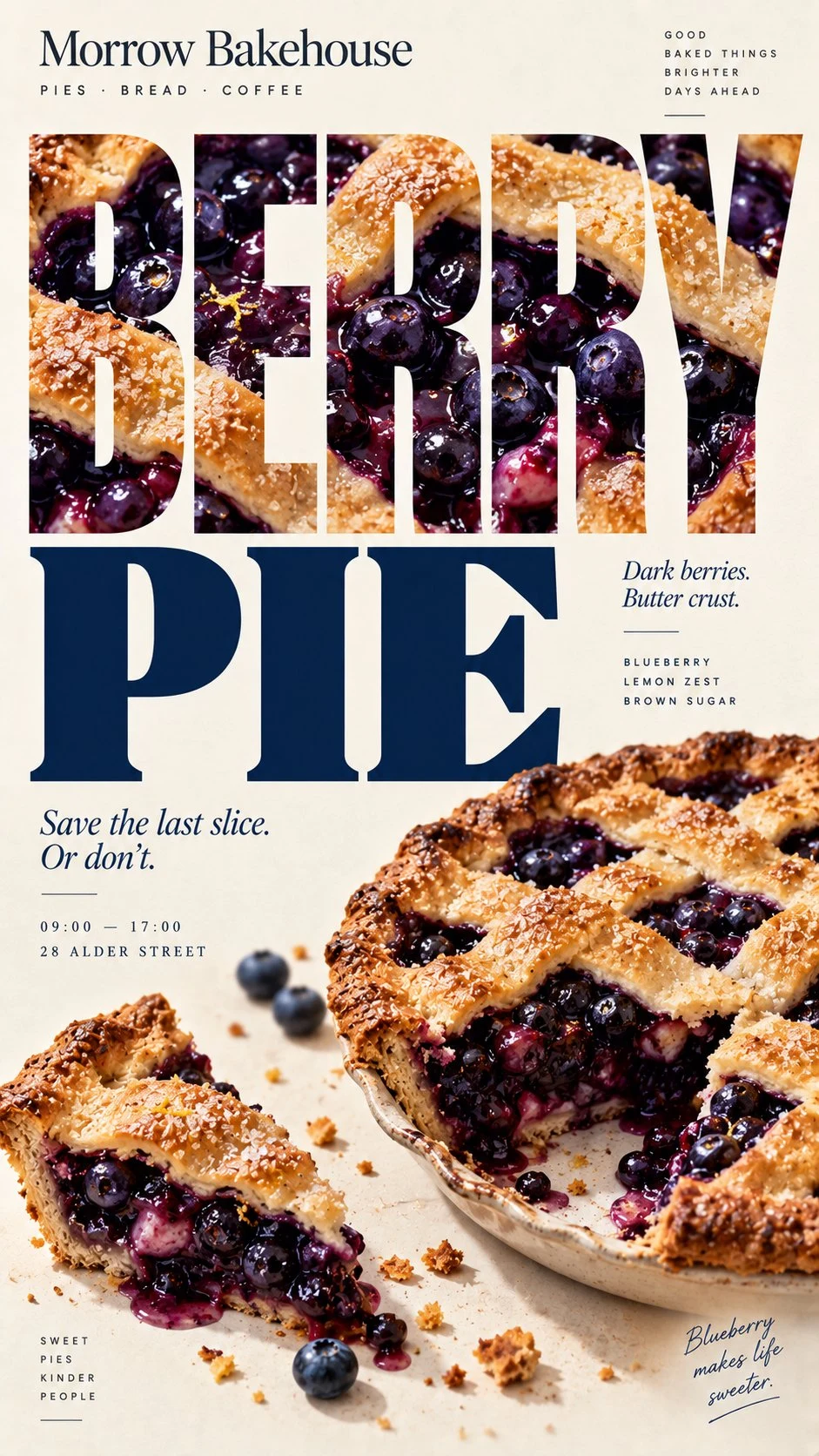
[BRAND]: {brand name} [FOOD / DISH]: {main product} [HEADLINE]: {main word or short title} [STRUCTURE]: {photo-filled type / food layers as grid / modular editorial grid / steam veil} [ACCENT COLOR]: {main typography color} [DETAILS]: {ingredients / short copy / hours / address} Create a 9:16 vertical food editorial poster that uses the food itself to build the visual structure of the page. Use a warm cream or ivory background with subtle paper texture, highly realistic food photography, expressive editorial typography and a controlled color palette. The result should feel like a real café, bakery or restaurant campaign rather than a reusable template. The key idea is that [STRUCTURE] should determine the composition. For “photo-filled type,” use one continuous food photograph inside large headline letters while keeping the word immediately readable. The image should flow naturally across all letters rather than using separate textures for each character. For “food layers as grid,” use the natural horizontal layers of the food—pastry, cream, fruit, fillings or other visible sections—as the alignment system for typography and small annotations. Let the food create the grid instead of drawing an artificial one over it. For “modular editorial grid,” divide the page into a few unequal photography and typography modules. Use different crops, scales and viewpoints, with one or two elements subtly crossing module boundaries so the layout feels editorial rather than like a simple collage. For “steam veil,” place bold typography behind genuinely hot food and let only the areas covered by natural rising steam become slightly softer, lighter or partially obscured. Keep all type outside the steam perfectly sharp. Do not use digital blur or smoke effects. Make [HEADLINE] and the food the two strongest visual anchors. Use bold display typography for the main title and a restrained serif or neutral sans serif for secondary information. Add only a few meaningful details such as [BRAND], ingredients, flavor notes, opening hours, address or one short brand line. Avoid generic filler copy. Use [ACCENT COLOR] alongside cream, natural food colors and dark neutrals. Keep the palette clean and cohesive. The final poster should be visually strong at thumbnail size, detailed when viewed closely, and built around one clear principle: the food does not simply sit inside the layout — its texture, layers, crops or atmosphere create the layout itself.
查看提示词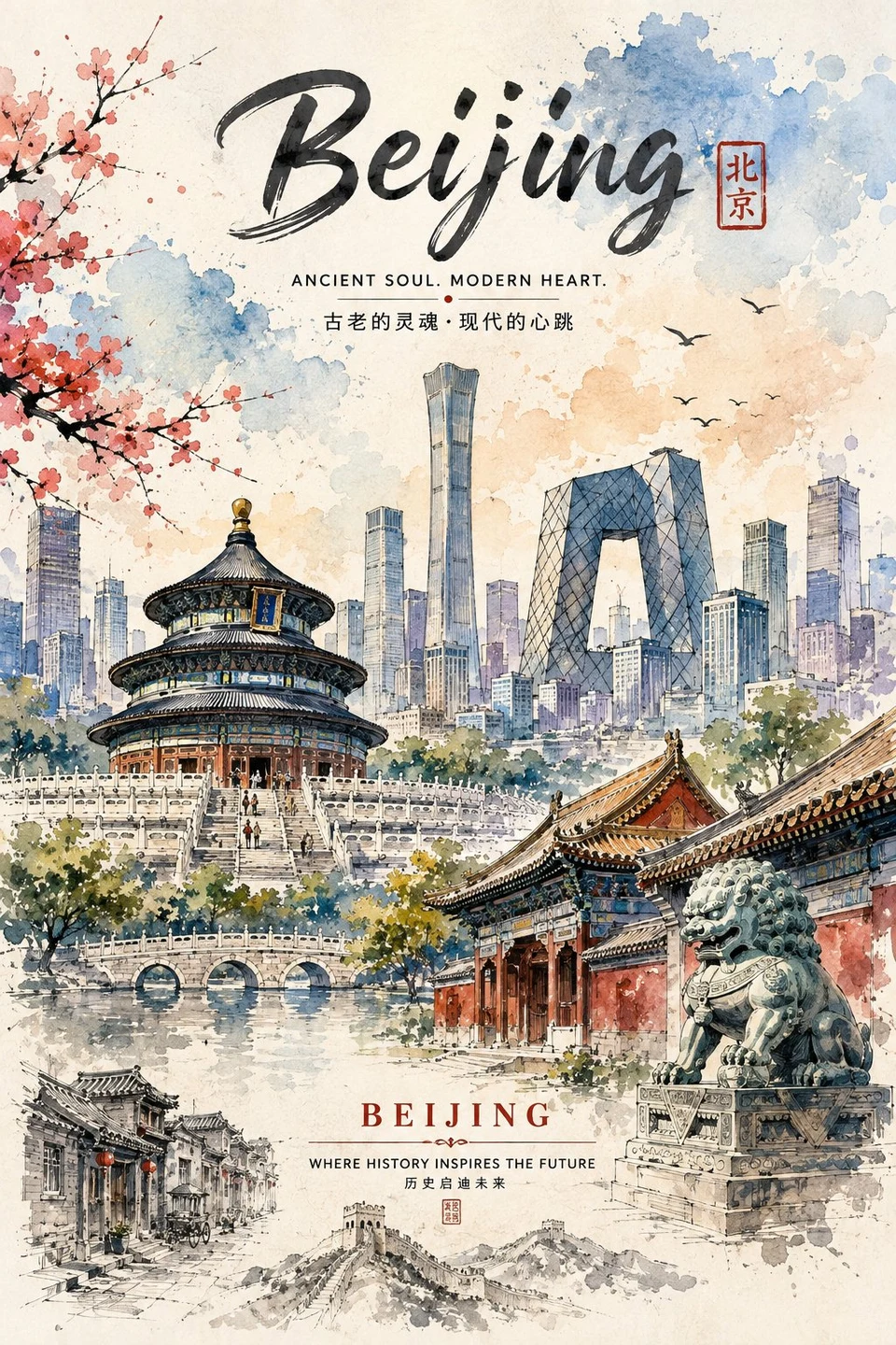
An artistic, travel-poster style digital illustration rendered in a delicate watercolor and ink technique, featuring a harmonious blend of ancient heritage and modern innovation. The scene is framed by soft, translucent splashes of blue, peach, and sepia watercolor washes on a textured paper background, accompanied by flowering cherry blossom branches on the left. In the foreground, traditional architecture with curved tiled roofs, narrow alleyways, and stone elements transitions seamlessly into a vibrant modern skyline in the background, filled with towering skyscrapers and iconic landmarks under a partly cloudy sky. The composition is balanced with elegant handwritten typography, bilingual subtitles, and vintage-style travel emblems, capturing a nostalgic yet vibrant mood.
查看提示词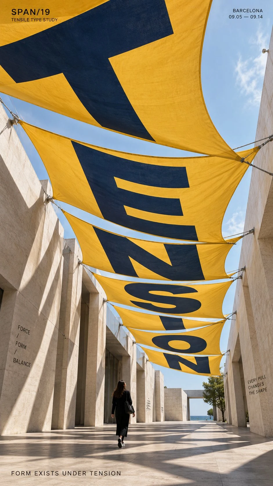
TITLE: [TENSION / DRIFT / FOCUS / REFRACT / your own word] PROJECT: [brand / exhibition / campaign name] ENVIRONMENT: [fabric canopy / terrain / mirror installation / water / other] TYPE MECHANISM: [surface distortion / terrain warp / reflection / refraction] SUBJECT: [small human figure / none] MAIN COLOR: [accent color] FORMAT: 9:16 vertical poster Create a contemporary perspective typography poster where oversized type is physically transformed by the material or environment around it. The main word should occupy roughly 35–55% of the composition and become part of the scene itself. Let the letterforms stretch, bend, split, compress or realign according to the chosen surface or optical medium. For fabric, let the type follow tension, curvature and suspended folds. For terrain, let it wrap across slopes, ridges and valleys. For mirrors, distort the source typography so the reflection resolves into a readable word. For water, use depth and refraction to shift and reconnect the letterforms. Keep the spatial logic physically believable, with correct perspective, occlusion, reflections, refraction and surface contact. Use one strong accent color against a restrained architectural or natural palette. Keep the typography bold, clean and highly legible from the intended viewpoint. If a person is included, keep them small and use them mainly as a scale reference or observer within the typographic space. Add only a small amount of secondary editorial information such as project name, date, location and one short thematic line. Overall style: perspective typography, spatial graphic design, contemporary installation art, editorial poster, strong depth, clean hierarchy and high visual impact.
查看提示词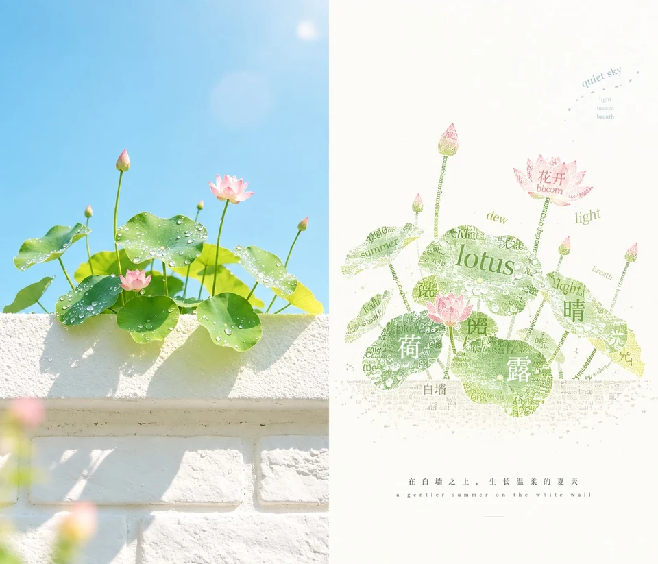
请将我上传的每一张照片分别制作成一张独立的高级设计海报,不多图拼接,每张照片单独输出。整体采用 3:4 竖版构图,上下两个区域高度严格 1:1,各占画面 50%。 上半部分保留原始照片,保持主体身份、结构、姿态、真实质感、自然光影和原有色彩氛围,仅进行轻微高级调色,使其具有艺术杂志、独立出版物与展览图像质感。为适配画幅,可自然扩展环境背景,但不得拉伸、扭曲或改变主体。 下半部分只提取照片中最具识别性的**主体、轮廓、结构、姿态与叙事关系**,重构为“**文字即图像**”的字体插画。不要完整复制照片,也不要保留所有对象,而是删去绝大多数背景与无关细节,将文字作为点、线、面和颗粒,通过**重复、缩放、旋转、疏密、路径排列与局部叠压**,重新塑造主体的轮廓、体块、走势与关键特征,使人一眼识别它与上方照片之间的对应关系。 文字本身必须承担造型功能,而不是贴在图像上的装饰。可用较大的字形成骨架与主要轮廓,用密集小字形成暗部、纹理和重量,用稀疏文字形成边缘、空气与消散感;局部可沿主体走势弯曲、聚集、断开或逐渐变疏,形成 **Typographic Illustration / Calligram / Typographic Texture / Visual Poetry** 的视觉语言。文字内容应从照片的主体、地点、情绪、动作、记忆或隐喻中提炼,语种根据画面语境自由选择,避免无意义乱码和机械重复。 下半部分必须保留**大量有意识的留白**。主体只占较小或适中的视觉面积,可偏心、贴边、悬置或局部裁切;留白与文字密度共同参与构图,通过正负形、聚散、尺度反差和不对称平衡建立呼吸感与空间感。原图即使背景杂乱、主体很小,也要通过删减、重组、裁切和尺度变化重新导演画面,而不是照搬原构图。 配色从上方照片中提取 **2–4 种最具生命力和辨识度的颜色**重新调制,适度提亮、提纯、去灰,使文字色彩清晰、鲜活、温暖而具有现代感;以大面积近白或与原图综合色温呼应的极浅底色作为呼吸空间,避免灰脏、暗沉、廉价高饱和和复杂多色。 整体呈现**文字图形化、具象文字造型、文字颗粒、视觉诗、大面积留白与高级编辑构图**共同形成的艺术效果:远看先读出一个简洁有力的图像,近看才发现整个主体由文字构成。避免普通文字排版、文字覆盖照片、完整场景复刻、写实描绘、背景填满、乱码、商业标题模板和复杂装饰。
查看提示词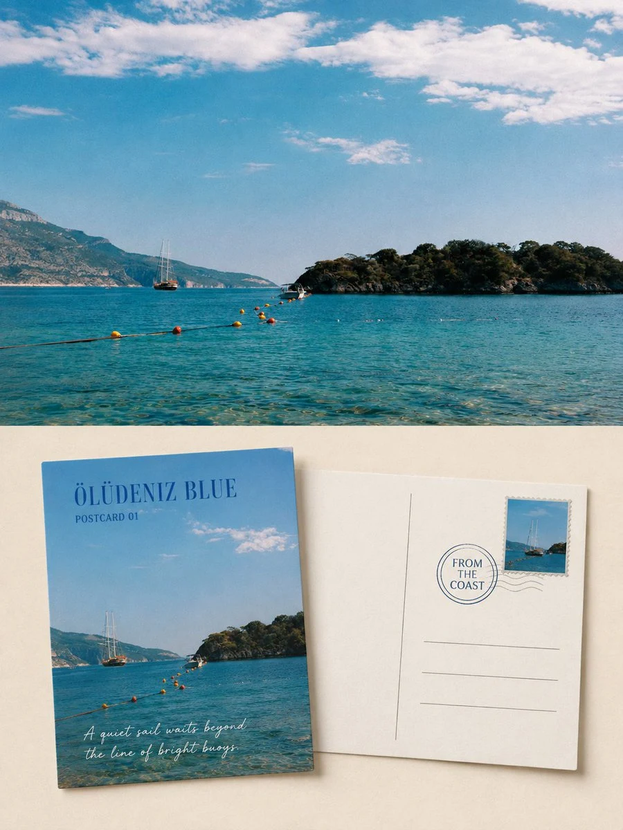
请将我上传的每一张旅行照片分别制作成一张独立的高级风景明信片正反面编辑海报,不多图拼接,每张照片单独输出。 整体采用3:4竖版构图,并清楚保留同一张原始旅行照片作为对比证据。上半部分或画面背景约占整张作品45%–55%,忠实呈现原始照片,准确保持山体、海岸、湖泊、建筑、船只、道路、植物、人物或动物的身份、数量、方向、比例、空间位置、观察角度、自然光影、真实质感和原有色彩氛围。仅进行轻微高级旅行摄影调色与极薄胶片颗粒处理,不得把照片插画化,不得替换天空、增删主体、移动景物、改变地形或重塑建筑。 在下半部分的暖白、浅象牙或由照片提取的安静浅色纸面上,同时陈列两张同尺寸、真实可触的实体明信片:一张展示正面,一张展示背面。两张卡片保持标准横向明信片比例,轻微错位或转角,但不得彼此大面积遮挡。清楚表现纸张厚度、硬挺边缘、细微磨损、自然投影和无涂布纸纤维。原始照片不能只被藏进正面卡片里,上方真实摄影区域仍需具有实质面积并清楚可辨。 正面明信片从原照片中重新选择最有代表性的风景裁切,保留主体最具识别度的轮廓、地形关系、天气、色彩和空间方向,但不要把完整照片等比例缩小塞进卡片。可放大一个视觉锚点,删除杂乱背景,让正面更像一张被认真选择的旅行风景印刷品。加入1–3个英文单词的地点或场景标题,以及“SCENIC NOTE 01”或“POSTCARD STUDY”等克制字段。 背面明信片使用清楚的中线、地址横线、邮票区与适度留白。邮票从同一照片中的主体、轮廓或强调色提炼而来,只保留一枚;邮戳保持克制,不虚构复杂邮政信息。在书写区放置一段不超过两句的原创旅行观察,只描述照片中真实可见的天气、光线、颜色、船、山、湖面、村落或空间感受。所有文字必须根据照片逐字确定,大小清楚可读。 纸张以暖白或浅象牙色为主,墨色从照片中的深蓝、灰绿、炭灰或棕色提取;邮票可以保留原照片的一处强调色。两张卡片约占下半区域45%–65%,四周至少保留30%连续低信息空场。标题与短句使用温和衬线、手写笔迹或邮政铅字,带轻微纸齿、断墨与旧印刷偏差,让文字真正属于明信片。 原始照片与明信片陈列区之间要有清晰、克制的层级关系。若采用上下结构,边界必须清楚,不雾化、不羽化、不混成同一张画。 整体参考收藏级旅行明信片、独立出版物、摄影档案和现代编辑设计,呈现安静、真诚、克制、有纸张温度和未说完故事的视觉气质。 避免多照片拼贴、九宫格、照片缺失、原图仅作微小装饰、重复卡片、过量邮票、复杂贴纸、虚构城市、长段乱码、作者名、账号、品牌、二维码、Logo、相框Mockup、手持展示、水印和廉价复古模板。
查看提示词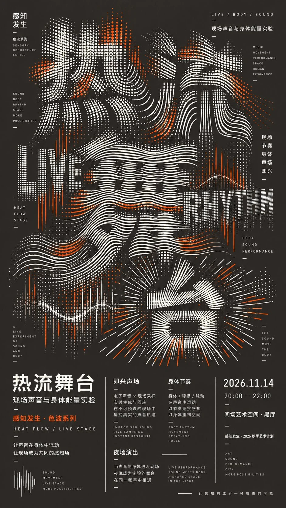
【主标题】: 【主题】: 【系列名】: 【背景色】: 【强调色】: 【点线机制】: 【次级文字】: 【活动信息】: 【画幅比例】:默认 9:16 设计一张高密度实验字体文化海报。 不要在普通字体上简单添加特效,而是使用点阵、弧线、波纹、放射线、栅格或扫描线直接重新构造【主标题】。不同文字使用不同但相关的点线机制,并形成连续变化,例如点阵 → 弧线 → 波纹 → 放射 / 栅格。 主标题占画面约 65%–70%。通过疏密、线距、曲率、压缩、拉伸和局部消失形成字形,允许少量牺牲可读性换取更强设计感。 加入明显的多层 Typography:巨大中文主标题 + 较大的中英文关键词 + 微型编辑文字 + 完整活动信息。不同尺度文字需要真正参与构图,而不是只做说明。 使用深色背景、浅色主图形和一种【强调色】。强调色只用于局部节点和关键词,保持克制。 下方保留完整编辑式信息区,采用不同栏宽、轻微错位、局部竖排与长短不一的分隔线,避免平均四栏、PPT 或 UI 卡片感。 整体要求密而有序、点线连续、文字层级丰富,远看有冲击,近看有细节。 不添加摄影、人物、3D、霓虹、随机乱码、二维码、水印、四角星芒和画面编号。只输出一张完整 9:16 海报。
查看提示词可以发展的海报方向
产品与电商海报
围绕商品、标题区域、价格或卖点空间、配色、道具和销售场景建立促销主视觉。
菜单与新品灯箱
把商品名称、辅助图片、口味或功能信息和小型信息区组织成可读层级。
旅行与编辑视觉
结合目的地、故事、核心插画、标题、次要文案和氛围艺术指导。
社交推广卡片
根据具体信息流、封面或活动位置调整信息层级、裁切、安全区域和文案数量。
如何生成 AI 海报
- 1
写清传播设定
说明海报目标、受众、平台、必须出现的文字、视觉优先级和最终画面比例。
- 2
规划信息层级
分开主标题、主图、辅助文案、标签、价格或活动信息和页脚内容。
- 3
描述视觉系统
写清网格、图像位置、留白、字体方向、配色、材质、光线和辅助图形。
- 4
校对并继续调整
检查每个文字、对齐、边距、对比度、裁切、宣传表述和品牌元素,并替换不可靠的生成文字。
海报案例与相关指南
海报提示词应包含什么
- 说明用途、受众、渠道、必须出现的文案、语言、输出比例和视觉优先级。
- 描述标题位置、主图、网格、留白、配色、字体方向和辅助图形。
- 让所需文字保持简短和结构化,并计划在发布前人工校对或替换。
- 使用前检查安全边距、对齐、对比度、图像裁切、宣传表述、Logo 和目标尺寸可读性。
AI 海报生成常见问题
- AI 海报能生成准确文字吗?
- 可以尝试,但拼写、顺序、标点和字形都可能错误。发布前必须校对每一行,并在设计工具中替换不可靠的文字。
- 海报应该选择什么比例?
- 按照最终投放位置选择,例如竖版印刷、信息流、故事、横幅或菜单灯箱。构图应从一开始就针对目标比例设计,而不是最后再强行裁切。
- 可以使用商品图或版式参考吗?
- 可以,但需要模型支持图片输入,而且你有权使用原图。请说明哪些构图或主体细节要保留,哪些内容需要改变。