创作

正在加载创作工具…

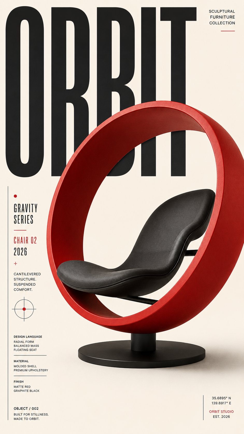
返回AI 图片作品:Orbit Chair 02 Editorial Poster Swiss Design 1/4
ShamsShams@ShamsAmin56openai model logoGPT-image2

AI 图片作品:Orbit Chair 02 Editorial Poster Swiss Design

Create a premium, highly engaging editorial poster for [SUBJECT / BRAND / EVENT / PRODUCT], designed around strong visual hierarchy, intentional composition, and immediate 2–3 second readability. **ART DIRECTION** Style: [Swiss / Brutalist / Bauhaus / Minimal / Editorial / Futuristic / Architectural / Luxury] Create a sophisticated contemporary graphic-design aesthetic rather than a generic advertising layout. Every element must have a clear compositional purpose. **01 — VISUAL HIERARCHY** Establish a clear viewing sequence: 1. Primary: "[MAIN HEADLINE]" 2. Secondary: "[HERO SUBJECT / IMAGE / OBJECT]" 3. Tertiary: "[SUBHEAD / DATE / DETAILS / CTA]" The main message must remain recognizable even when viewed as a small thumbnail. **02 — TYPOGRAPHY** Use typography as an active visual element rather than simple text placement. Use: - Oversized display typography - Strong differences in scale - Tight, intentional kerning - Controlled line spacing - Strategic cropping - Stacking and vertical alignment - Selective text/subject overlaps - Typographic masking where appropriate Use maximum 1–2 complementary typefaces. Primary typography: [BOLD CONDENSED / GROTESK / SERIF / CUSTOM] Secondary typography: clean neutral sans-serif. Keep all important text accurately spelled, readable, and professionally typeset. **03 — COMPOSITION** Build the poster using a disciplined editorial grid. Create: - One dominant focal point - Strong alignment - Clear margins - Asymmetrical balance where appropriate - Controlled tension - Intentional negative space - One or two elements subtly breaking the grid Avoid placing every element in the center. Balance visual weight across the entire canvas. **04 — HERO VISUAL** Feature [SUBJECT] as the primary visual. Presentation: "[FULL-BLEED / CUTOUT / 3D / PHOTOGRAPHIC / ILLUSTRATED / PAPER-CUT / ABSTRACT]" Integrate the subject with the typography using layering, masking, foreground/background relationships, or controlled overlap. The subject and headline should feel like one unified composition, not an image with text placed on top. **05 — SCALE** Use dramatic scale contrast: Huge: main headline or hero element Medium: secondary information Small: supporting copy Micro: technical/editorial details Avoid using similar sizes for every element. **06 — COLOR** Palette: Background: "[COLOR]" Primary: "[COLOR]" Accent: "[COLOR]" Use a restrained 2–4 color system with one dominant accent. Prioritize strong tonal contrast and readability. **07 — DEPTH & LAYERING** Hierarchy > Typography > Subject > Contrast > Negative Space > Details **AVOID** Generic centered layouts, excessive text, random decorative shapes, weak hierarchy, equal-sized elements, excessive fonts, unnecessary gradients, clutter, illegible typography, arbitrary placement, excessive effects, oversaturation, cheap advertising aesthetics, fake logos, watermarks, duplicated objects, malformed typography, and meaningless micro-text. **OUTPUT** Aspect ratio: "[4:5 / 2:3 / 3:4 / 9:16 / 16:9]" Quality: ultra-high-resolution, print-quality finish Layout: balanced from all edges with deliberate margins and professional spacing.

标签
Editorial PosterFurniture AdMinimalist PosterProduct DesignRed ChairSculptural ChairSwiss Design

相关推荐

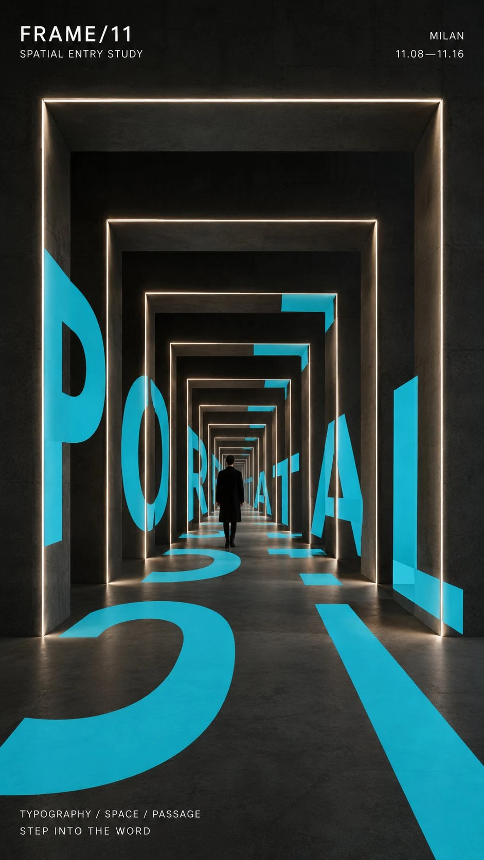
portal corridor with turquoise typography and
4
Larus Canus 的创作者头像Larus Canus
收藏去 X 查看
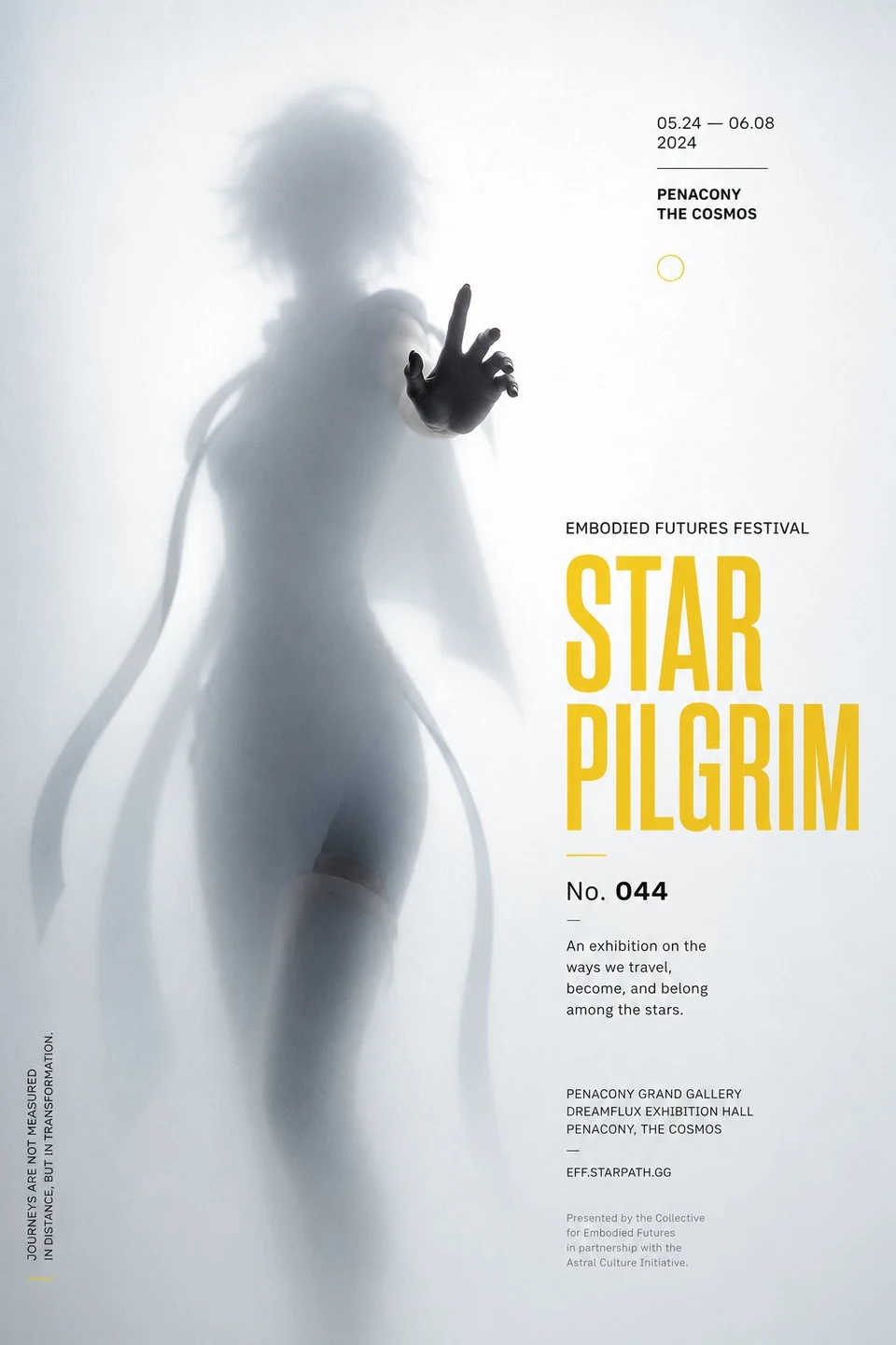
Abstract Festival Poster Blurred Silhouette
4
VoxCat 的创作者头像VoxCat
收藏去 X 查看
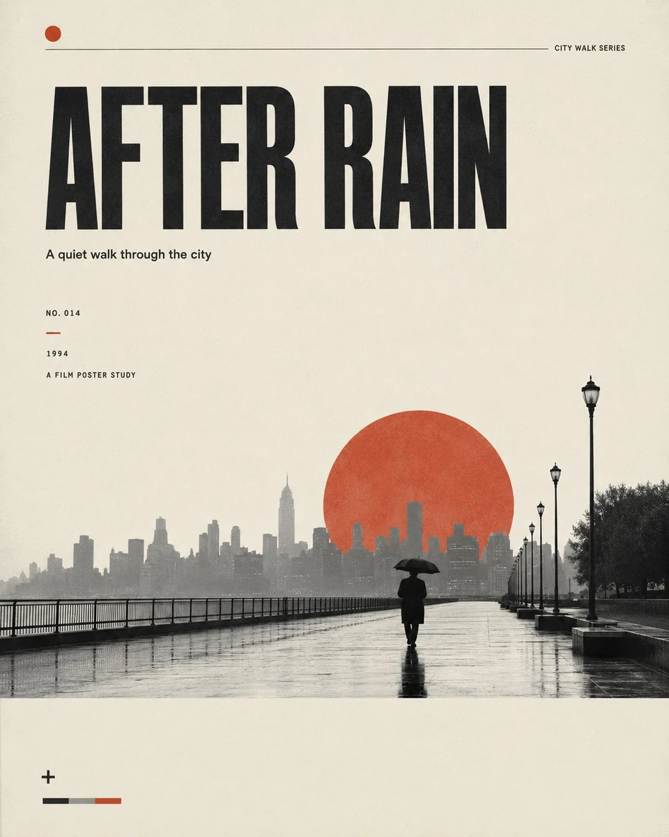
After Rain Minimalist Editorial Film Poster With Red
4
Larus Canus 的创作者头像Larus Canus
收藏去 X 查看