创作

正在加载创作工具…

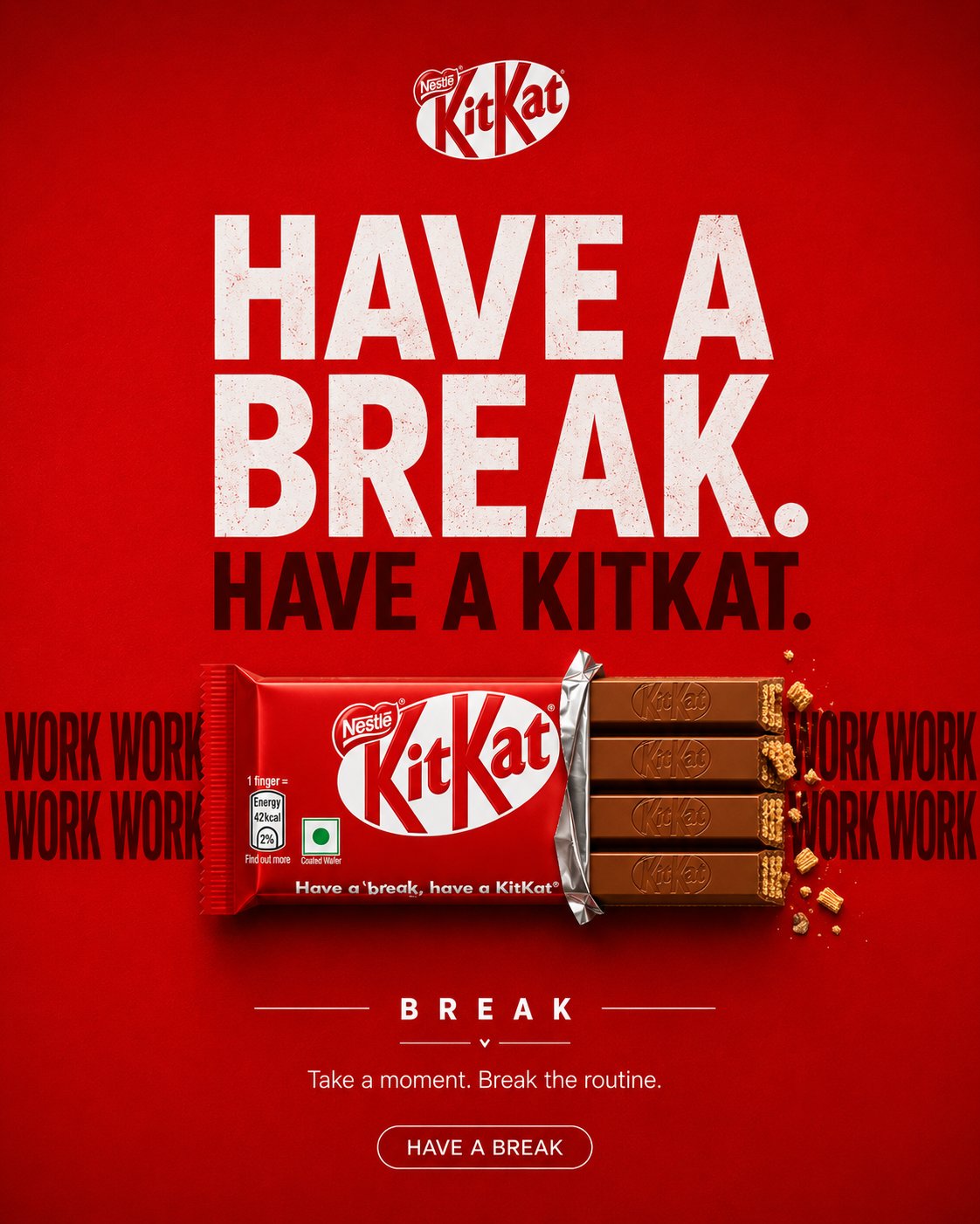
返回AI 图片作品:KitKat advertising poster red background chocolate 1/4
ᴍᴜʀᴘʜʏᴍᴜʀᴘʜʏ@Diplomemeopenai model logoGPT-image2

AI 图片作品:KitKat advertising poster red background chocolate

A creative campaign built around one simple truth: your day feels incomplete without a break. Try it with prompt structure ; KITKAT — THE BREAK CREATIVE DIRECTION Create a premium, agency-level KITKAT advertising poster inspired by the visual language of the supplied reference campaign images: bold FMCG social advertising, strong graphic composition, oversized typography, controlled product photography, clean negative space, saturated brand colour, tactile realism and one instantly understandable visual metaphor. Do not copy any specific reference composition, layout or artwork. Extract the common creative principles and build an original KITKAT execution. The poster must feel like a real global FMCG campaign created by a senior art director and photographed by a premium commercial product photographer. Core idea: THE KITKAT LITERALLY CREATES THE BREAK. The visual should communicate the concept before the viewer reads the copy. ⸻ CAMPAIGN DNA Brand: KITKAT Product: Classic KITKAT 4-Finger Milk Chocolate Bar Campaign territory: Have a Break Concept: The Break Personality: playful, clever, youthful, confident, instantly recognizable Colour system * Dominant KITKAT red * Deep chocolate brown * White * Very subtle cream * Restrained dark red The red should create immediate KITKAT ownership without making the image look like a generic red advertisement. ⸻ CREATIVE IDEA — “THE BREAK” Build the entire poster around one graphic interruption. A continuous horizontal typographic rhythm runs across the composition: WORK WORK WORK WORK WORK WORK The repetition represents the endless pressure and routine of the workday. At the exact centre of the sequence, the rhythm is interrupted. The KITKAT occupies that interruption. The product should visually function as the missing section of the continuous line. The viewer should instantly understand: WORK → WORK → WORK → KITKAT → BREAK The KITKAT is not placed on top of the concept. The KITKAT IS the interruption. Make the relationship between typography and product feel physically constructed, as if the chocolate bar has literally broken the repeated word pattern. ⸻ CREATIVE EXECUTION Graphic visual metaphor + premium product hero + editorial FMCG poster Use: * oversized typography * product geometry * repetition * negative space * scale contrast * visual interruption * controlled shadows * strong alignment * premium product photography Avoid environmental storytelling. This must NOT look like a lifestyle photograph. ⸻ BACKGROUND Create a completely controlled studio advertising field. Use a rich, saturated KITKAT red background with subtle tonal depth. The background may contain: * extremely subtle paper/fabric texture * restrained radial falloff * very soft tonal gradients * faint dimensional shadowing Keep it fundamentally flat, graphic and intentional. No realistic environment. No room. No desk. No office. No architecture. No furniture. No landscape. No scenery. No decorative objects. ⸻ HERO PRODUCT Use the uploaded KITKAT product reference as the primary packaging reference. Preserve its recognizable packaging identity and proportions. Create a premium commercial interpretation of the classic KITKAT 4-Finger Milk Chocolate Bar. The product should sit horizontally across the centre of the composition, acting as the physical break in the typography. Partially unwrap the right side so the four chocolate fingers are visible. Packaging accuracy Preserve: * iconic KITKAT red wrapper * accurate white KITKAT wordmark * Nestlé branding where present on the reference packaging * four-finger format * authentic wrapper proportions * realistic wrapper folds * realistic printed packaging * believable foil * subtle material reflections * natural wrapper tension * accurate chocolate geometry Do not invent packaging details. Do not redesign the logo. Do not create a fictional KITKAT package. The uploaded reference is the visual source of truth for the product. ⸻ CHOCOLATE The exposed chocolate fingers must look physically real. Show: * four distinct fingers * embossed KITKAT detailing * realistic milk-chocolate colour * subtle tempering variation * crisp edges * visible wafer layers at the broken end * tiny natural wafer crumbs Use restrained crumbs only around the break. No chocolate splash. No melting chocolate. No floating chocolate pieces. No exaggerated CGI effects. The chocolate should look edible, tactile and premium. ⸻ TYPOGRAPHIC SYSTEM Typography is an essential part of the visual metaphor. Primary headline HAVE A BREAK. Secondary headline HAVE A KITKAT. Use a bold contemporary grotesk / heavy sans-serif typeface. Typography should feel like professional FMCG campaign typography, not a Canva template. Large scale. Tight but controlled spacing. Strong alignment. Minimal decoration. ⸻ “WORK” SYSTEM Place repeated WORK typography horizontally behind the KITKAT. Example: WORK WORK WORK WORK [KITKAT] WORK WORK WORK The product must interrupt the sequence.

标签
Advertising PosterBrand CampaignChocolate BarFmcm MarketingFood AdvertisementKitkatProduct Photography

相关推荐

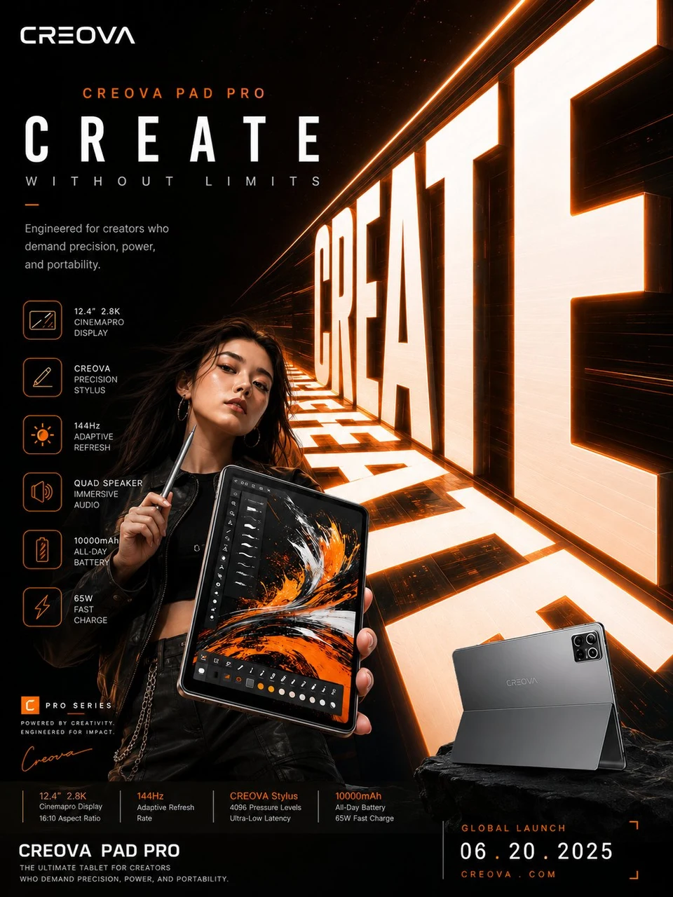
Digital creative tablet campaign poster with glowing
4
Larus Canus 的创作者头像Larus Canus
收藏去 X 查看
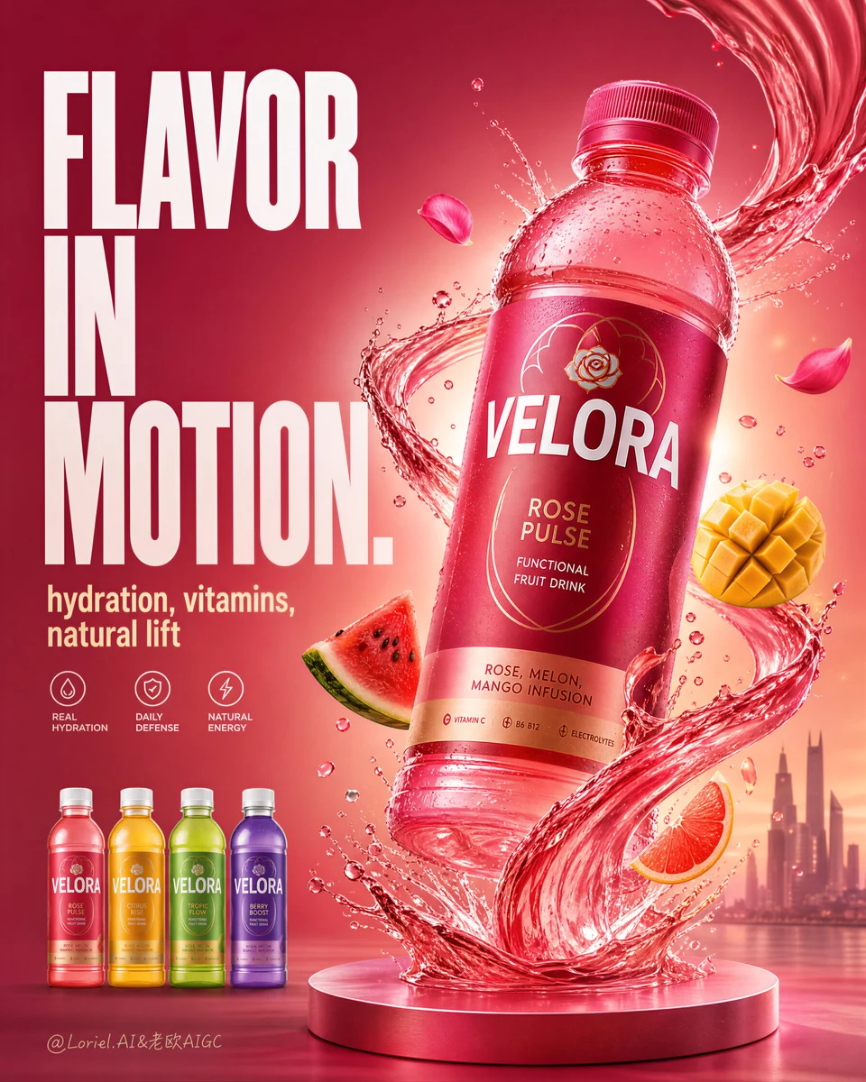
VELORA functional fruit drink advertising poster
Loriel.AI 的创作者头像Loriel.AI
收藏去 X 查看