创作

正在加载创作工具…

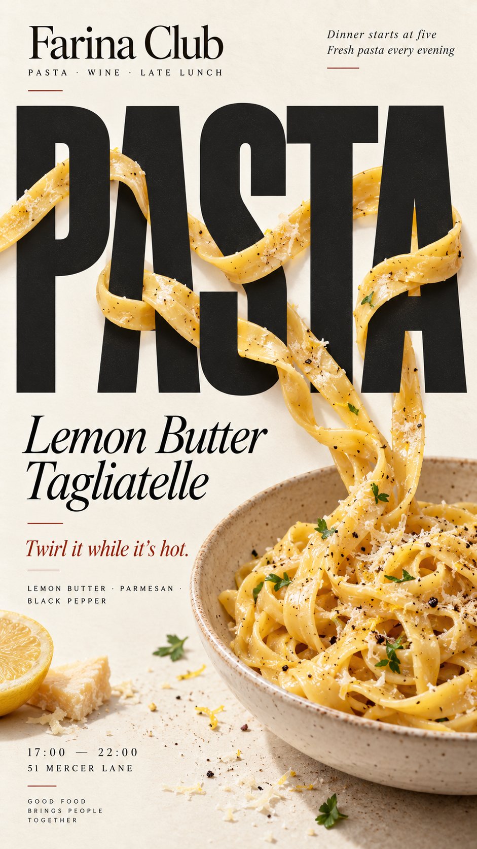
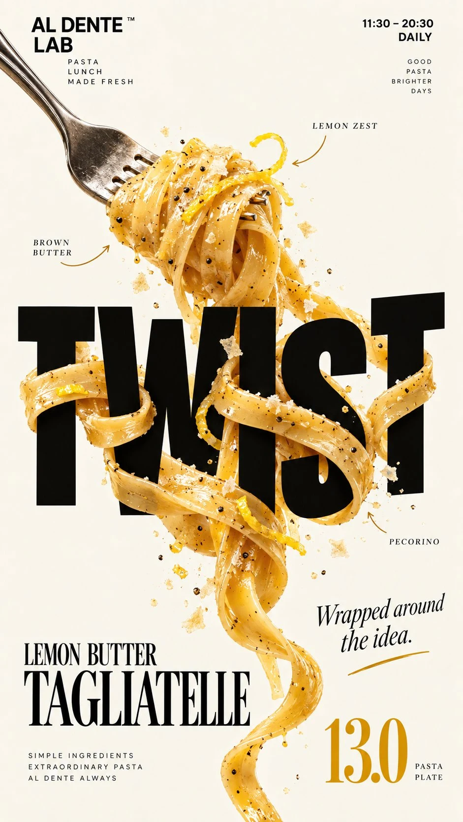
返回AI 图片作品:weaving tagliatelle pasta editorial poster 1/4
Larus CanusLarus Canus@MrLarus

AI 图片作品:weaving tagliatelle pasta editorial poster

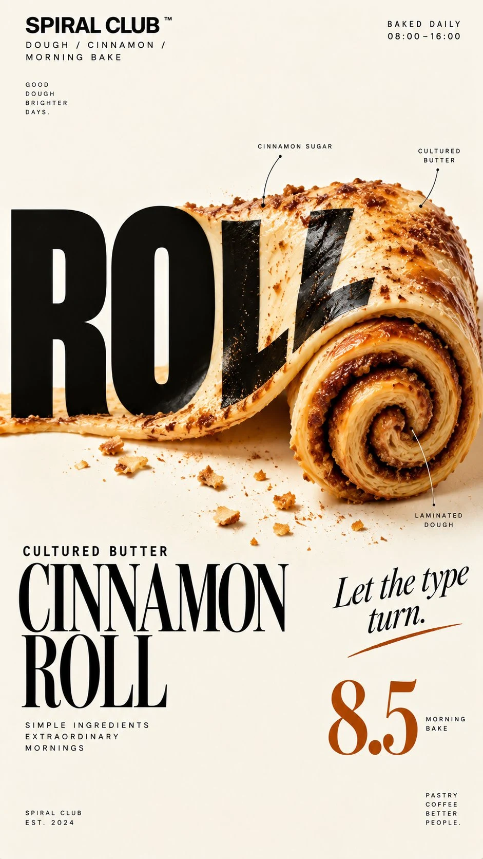
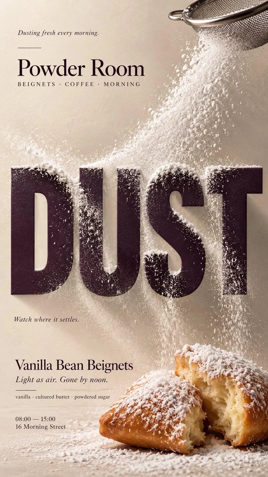
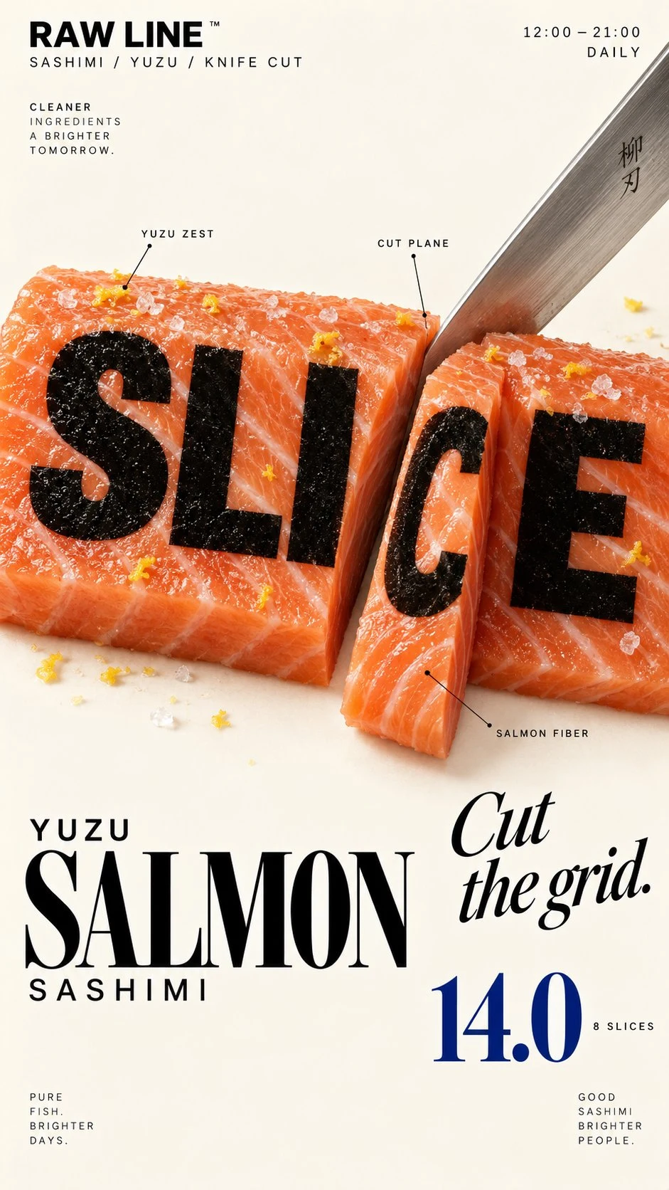
[BRAND]: {brand name} [FOOD / DRINK]: {main product} [HEADLINE]: {main word or short title} [INTERACTION]: {weave through type / refract type / create negative space / replace a letter} [ACCENT COLOR]: {main typography color} [DETAILS]: {ingredients / short copy / hours / address} Create a 9:16 vertical food editorial poster combining highly realistic food photography with bold, expressive typography. Use a warm cream or ivory paper background with subtle natural texture. Keep the food or drink realistic, appetizing and materially believable, with natural highlights, shadows, texture and proportions. Avoid CGI, plastic surfaces, floating cutouts or overly polished commercial rendering. The key concept is that the food must physically interact with the typography according to [INTERACTION], rather than simply sitting beside the text. For “weave through type,” let a few continuous food elements move naturally in front of and behind large letters with clear, believable depth. For “refract type,” place transparent glass or liquid in front of the headline so only the letters seen through it are naturally shifted, enlarged or distorted by real optical refraction. For “create negative space,” let the shape or missing portion of the food create a clean empty area where the headline naturally fits. For “replace a letter,” use the food itself as one recognizable letter inside the headline while keeping the full word immediately readable. Make [HEADLINE] one of the strongest visual elements using bold editorial typography. Integrate type and food into the same composition with clear hierarchy, strong negative space and intentional cropping. Add only a few useful brand details such as [BRAND], ingredients, flavor notes, opening hours or address. Keep all copy short and meaningful. Use [ACCENT COLOR] as the main typographic accent alongside cream, natural food colors and dark neutrals. Keep the palette controlled. Avoid numbered labels, 01/02, Vol., sparkles, generic filler copy, unnecessary decoration, UI-style cards or template-like layouts. The final poster should feel like a real café, bakery or restaurant campaign: visually striking at thumbnail size, detailed up close, and built around one clear idea where food and typography genuinely affect each other.

标签
Editorial DesignFood PhotographyFood PosterMenu DesignPasta DesignRestaurant MarketingTypography

相关推荐

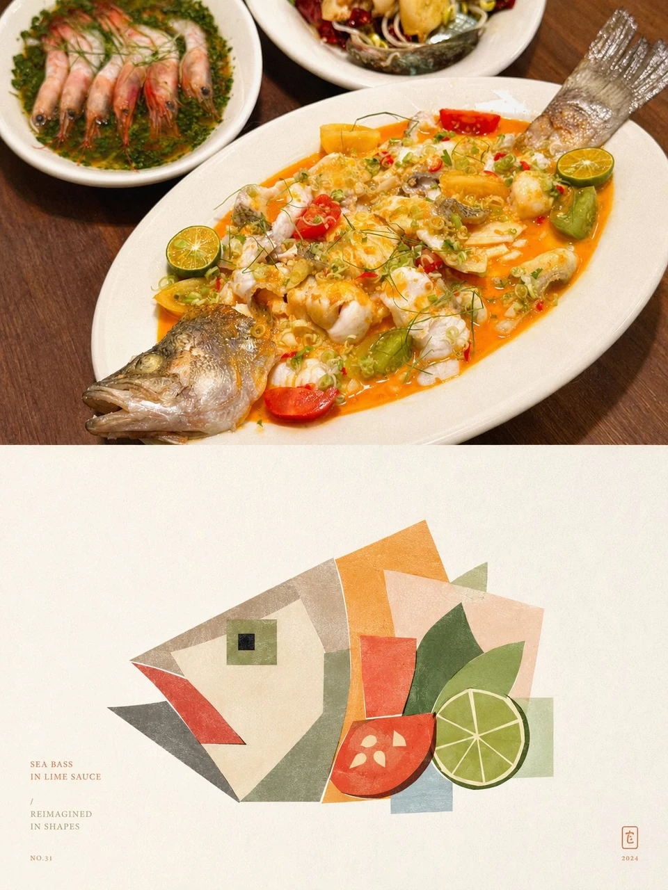
Geometric food art poster with photo and abstract
4
小小东 的创作者头像小小东
收藏去 X 查看
burnt vanilla cheesecake editorial poster
4
Larus Canus 的创作者头像Larus Canus
收藏去 X 查看
Zhi Shan Yan Chinese Restaurant Brochure Design
4
Larus Canus 的创作者头像Larus Canus
收藏去 X 查看
Maple Syrup Dripping Over Typography on Pancake Food
4
Larus Canus 的创作者头像Larus Canus
收藏去 X 查看
Hot honey pepperoni pizza editorial food poster
4
Larus Canus 的创作者头像Larus Canus
收藏去 X 查看
Hand-drawn Nanyang Brunch Food Poster
4
Larus Canus 的创作者头像Larus Canus
收藏去 X 查看