Theme:
Main palette:
Spatial idea:
Micro scene:
Title:
Event details:
Aspect ratio: 9:16
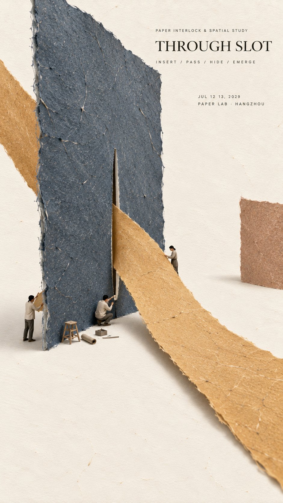
Create a refined vertical editorial poster using tactile handmade paper, large color fields, generous negative space, and a tiny micro scene.
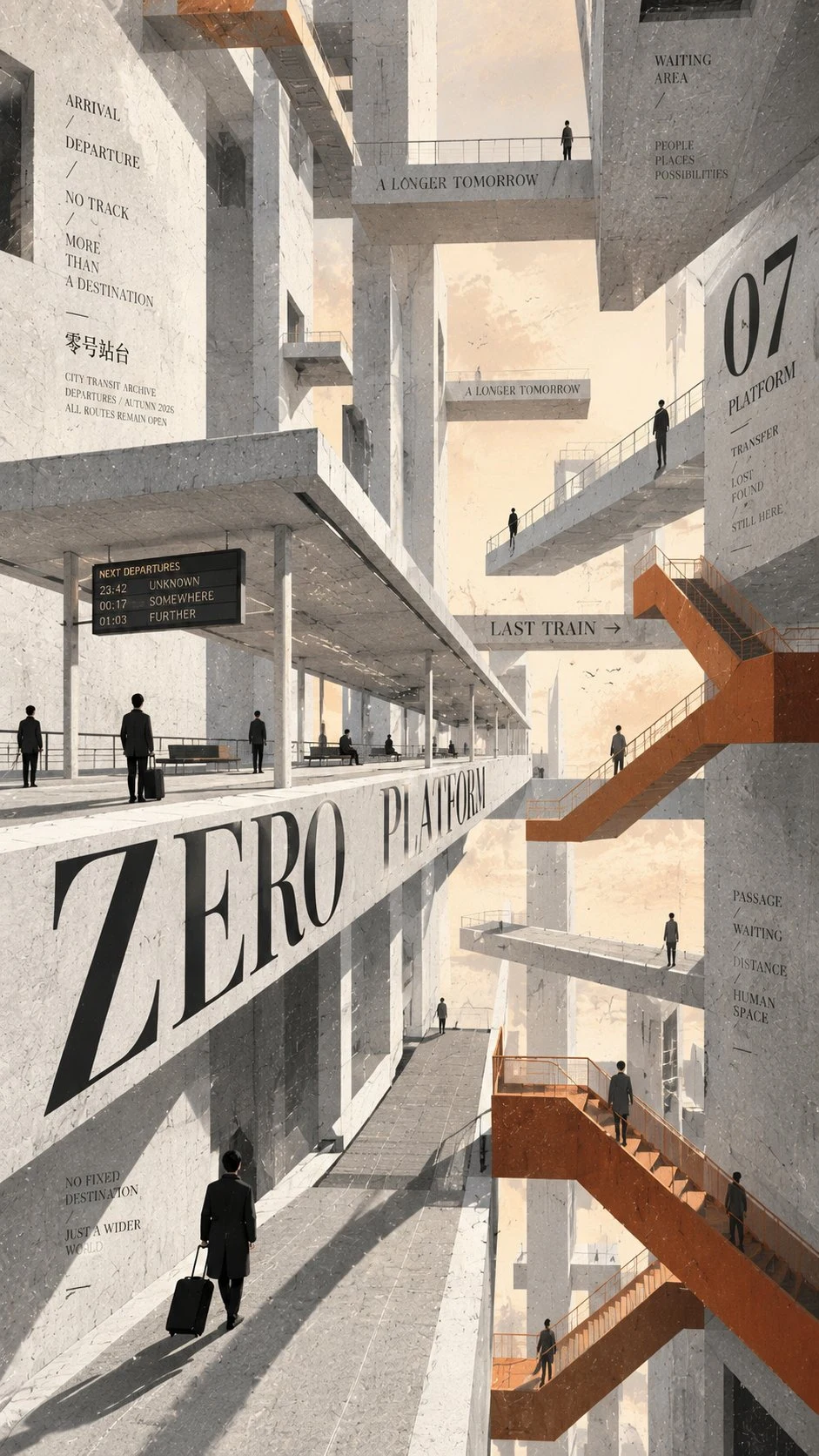
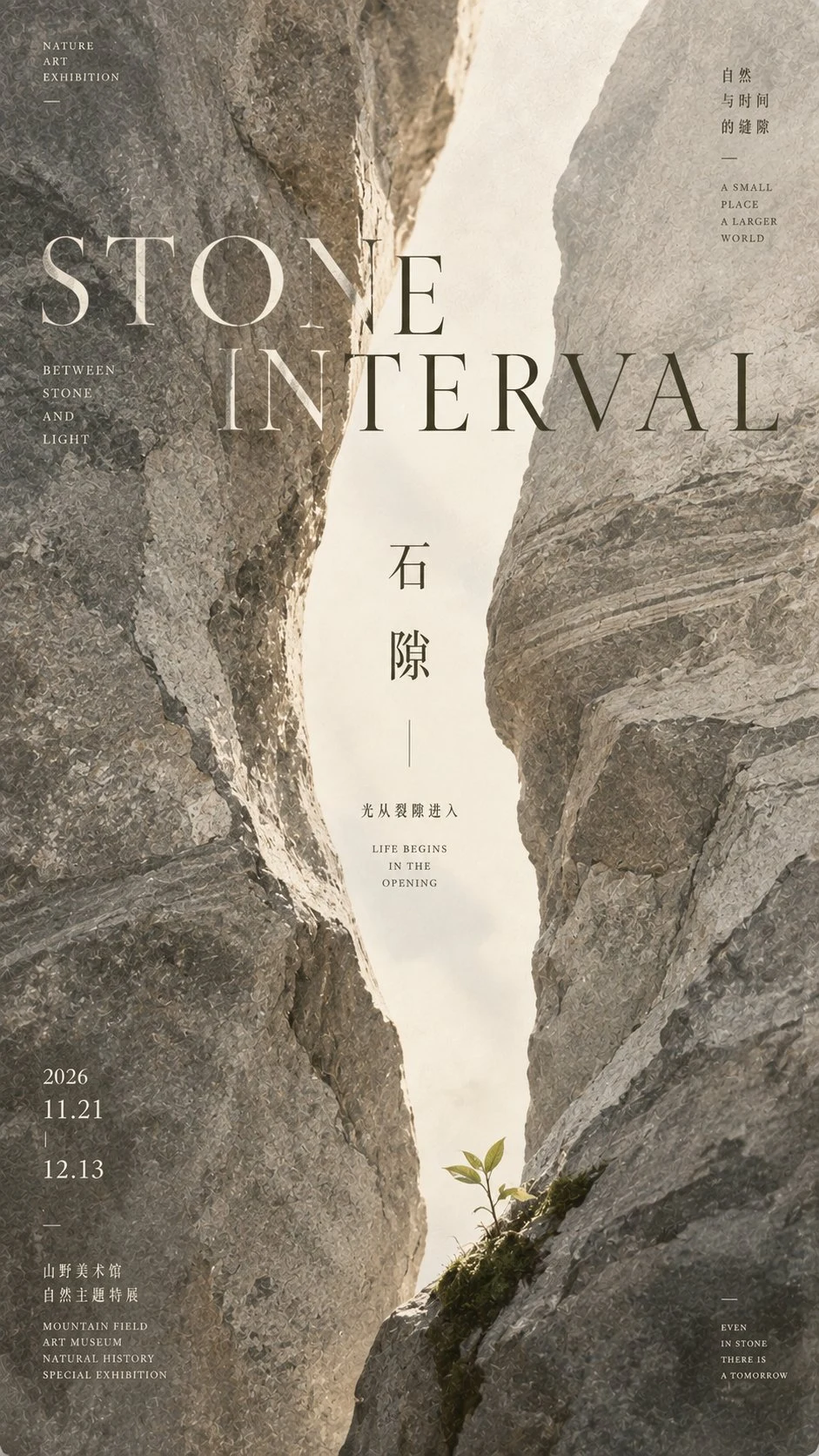
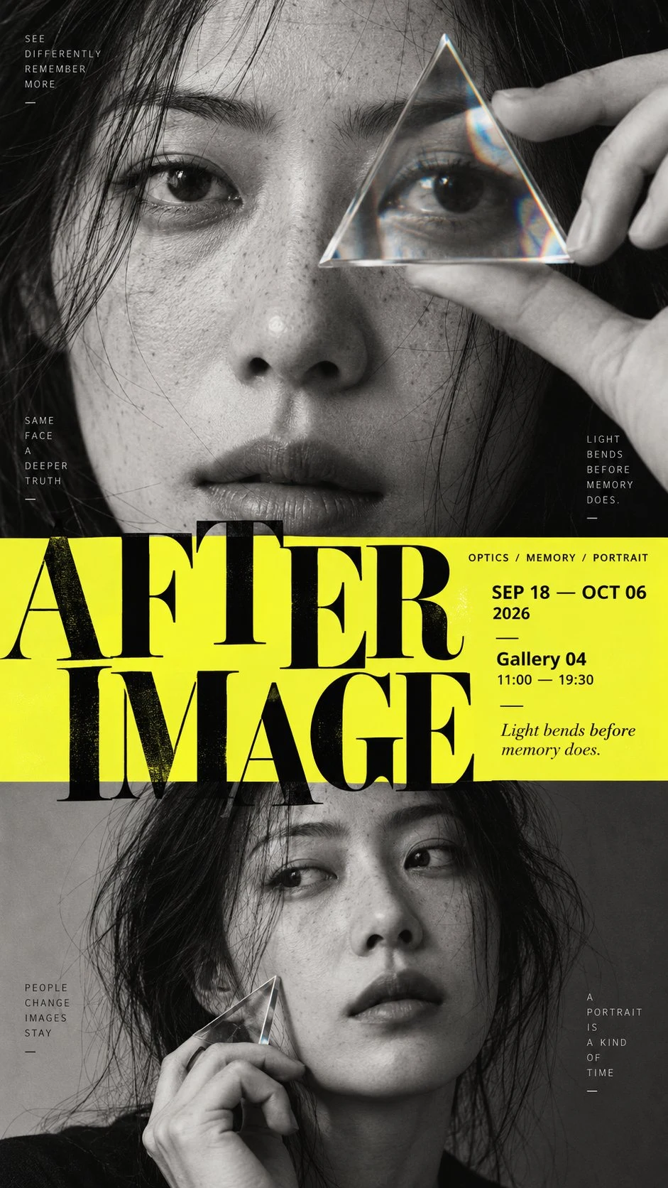
Keep the composition minimal, but do not make it empty or simplistic. Build the entire poster around one clear visual idea or physical paper interaction. The concept should be immediately readable from a distance, while smaller material and spatial details become visible only when viewed closely.
Use only one or two dominant handmade paper forms. Let them interact through one deliberate spatial mechanism such as passing through a slot, being pulled under tension, forming one sweeping curve, creating a deep perspective, lifting from the surface, or defining a large negative space.
The paper must feel physical and handmade. Show visible natural fibers, pulp texture, subtle pigment absorption, small embedded flecks, soft pressure marks, slightly irregular edges, and a matte dry surface. Keep the material clean, refined, and contemporary.
Use perspective, overlap, scale, paper thickness, soft natural shadows, subtle curvature, or suspension only when they help explain the physical construction. Avoid decorative effects that do not have a structural purpose.
Add one very small micro scene related to the main concept. Include two or three adult figures naturally interacting with the paper structure, such as holding, measuring, pulling, aligning, inspecting, lifting, or assembling it. The figures and tools should occupy only about 2% to 4% of the composition.
Keep the figures modern, understated, and secondary. Add only a few necessary tools or objects that help explain how the paper structure works.
Use generous warm ivory negative space so the poster feels calm and editorial. Large empty areas should be intentional and balanced against the main paper form.
Typography should remain restrained. Use a refined editorial serif for the title and small uppercase sans serif for supporting information. Keep the title relatively small and place it in a quiet area of negative space.
The visual reading order should be:
large paper form first, spatial interaction second, material texture third, micro scene fourth, title and event details last.
The final image should feel minimal, tactile, intelligent, spatial, refined, and carefully constructed.
From a distance, it should read as a simple arrangement of large paper forms.
Up close, it should reveal fibers, depth, tension, overlap, shadows, tiny figures, tools, and the physical logic behind the composition.