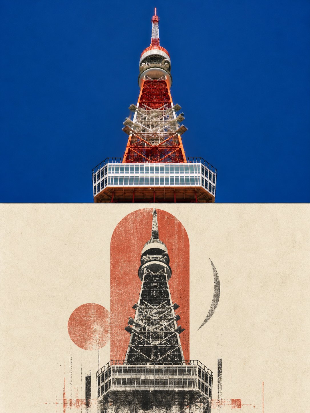
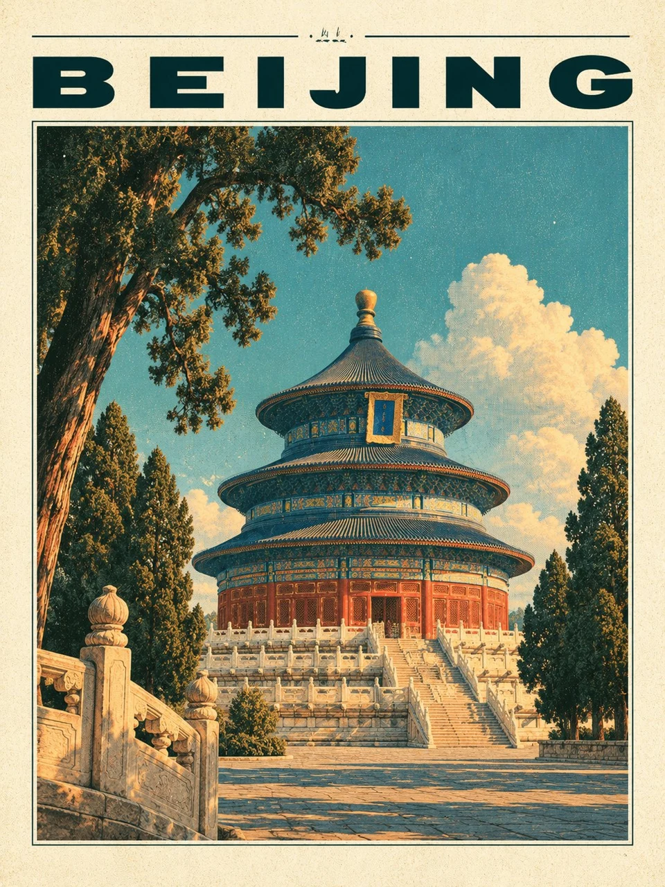
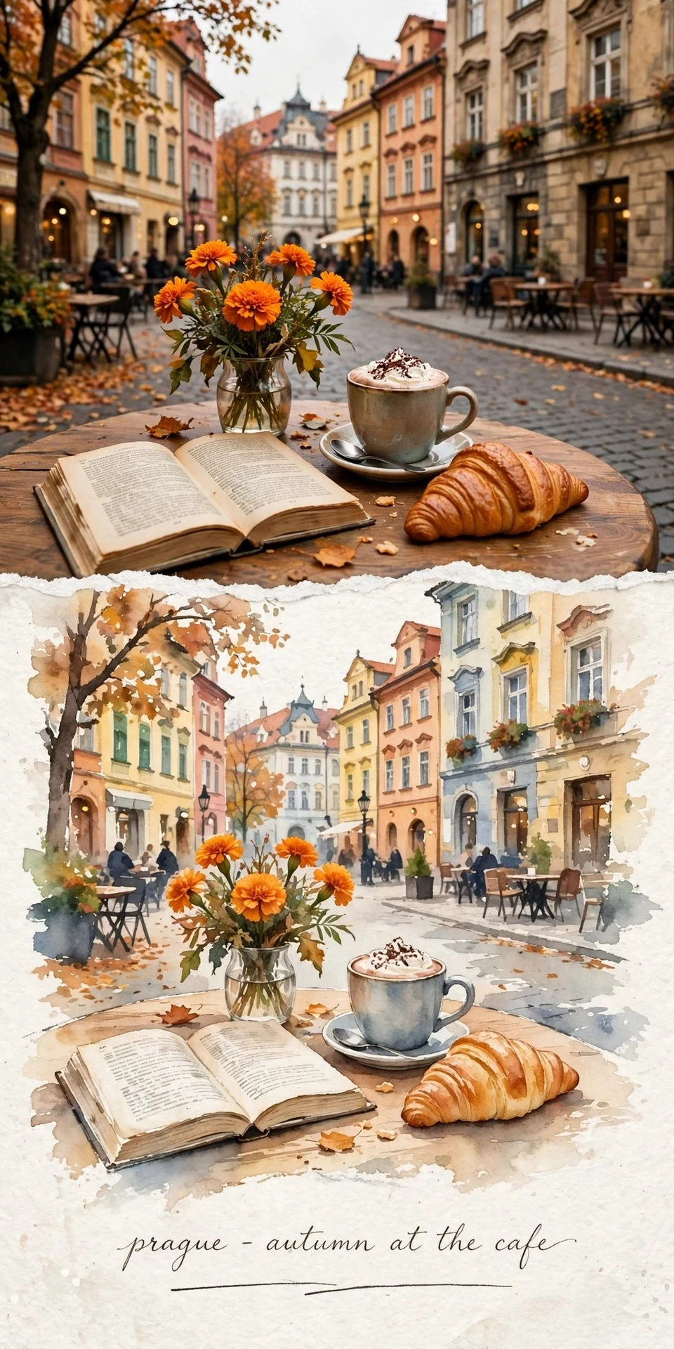
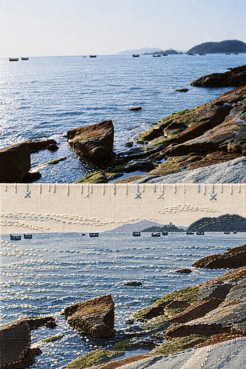
Please transform each uploaded travel photo into a standalone high-end landmark art poster. Output each photo as a separate piece, with no multi-image collages allowed. Default to a 3:4 vertical pure reinterpretation composition, without retaining split-screen layouts from top to bottom, and avoid including original photo areas, frames, walls, or handheld mockups.
First, identify the visual structures in the photo that truly define the location's recognizability, selecting a key set of primary relationships from architecture, monuments, bridges, towers, stations, ships, peaks, islands, coastlines, or urban skylines.
Accurately preserve from the original photo:
- Landmark identity and number of main subjects
- Viewing angle and spatial orientation
- Building outlines and hierarchical relationships
- Roof rhythms, tower proportions, bridge spans, archways, or major openings
- Mountain ridges, shorelines, water baselines, and key negative shapes
- Iconic structures that allow instant recognition of the original location
Actively remove tourists, vehicles, dense vegetation, advertisements, window panes, tiny text, decorative elements, and photographic noise. Do not add buildings, vehicles, cultural symbols, or secondary landmarks absent from the photo to enhance a sense of "place."
Reinterpret the main subject as rough black architectural relief printing. Blend woodcut, drypoint, copperplate etching, and vintage screen-printing techniques, using dense but uneven hatching, cross-hatching, broken ink surfaces, incisions, dry-brush gaps, partial ink bleeds, rough edges, and paper show-through to render form.
The main subject must not become a smooth black silhouette or resemble photo auto-tracing. Architectural white walls, snow cover, sky openings, and water highlights can be directly expressed through paper negative space, allowing the white areas to truly participate in the subject's structure.
Place 2 to 3 large modernist geometric blocks behind the main subject. All geometric shapes must be derived from the current photo's own structures, outlines, or negative spaces, for example:
- Extract circles, semicircles, or low ellipses from the sun, domes, landmasses, or visual centers;
- Extract vertical arches and curved surfaces from archways, doorways, tower bodies, sails, valleys, or curved roofs;
- Extract slanted or angular blocks from roof gables, hillsides, bridge spans, and building folds;
- Extract narrow crescents, black slices, or upright structures from subject sides, structural depth, distant mountains, and spatial shadows.
Different photos must generate distinct geometric combinations based on their respective subjects. Do not mechanically add the same circles, arches, or suns to all works. The geometric blocks are responsible for organizing space and rhythm, and must not devolve into logos, badges, or pure decorative patterns.
The geometric color blocks should possess authentic printing textures, including slight misregistration, worn edges, uneven ink, grain, scuffs, gaps, and localized paper show-through. Avoid clean vector graphics, digital gradients, and smooth software edges.
The entire composition uses warm ivory, old book-page cream, or light gray-brown print paper. The paper features fine fibers, subtle impressions, ink stains, and natural wear, but aging must be restrained—avoid charred edges, treasure-map effects, or full-sheet stains.
Compress the main subject and geometric color blocks into a compact visual island, occupying about 32% to 52% of the frame, positioned according to the original photo's focal point in the central lower, lower left, or lower right area. Retain at least about 30% to 40% continuous blank space above, with ample breathing room on the left and right.
Do not fill the canvas with the landscape as in the original photo. The sky, air, distance, and complex backgrounds from the photo can be directly represented by the blank paper.
At the base of the main subject, use only sparse, intermittent black and spot-color horizontal strokes to suggest water surfaces, roads, platforms, horizons, reflections, or shorelines. The strokes should gradually break, wear, and fade into the paper toward the sides and bottom, without forming a complete background, regular plinth, or enclosed landscape.
Overall colors use only:
- Warm paper base tone
- Carbon black relief ink
- One matte spot color extracted and generalized from the original photo
The spot color can be brick red, oc