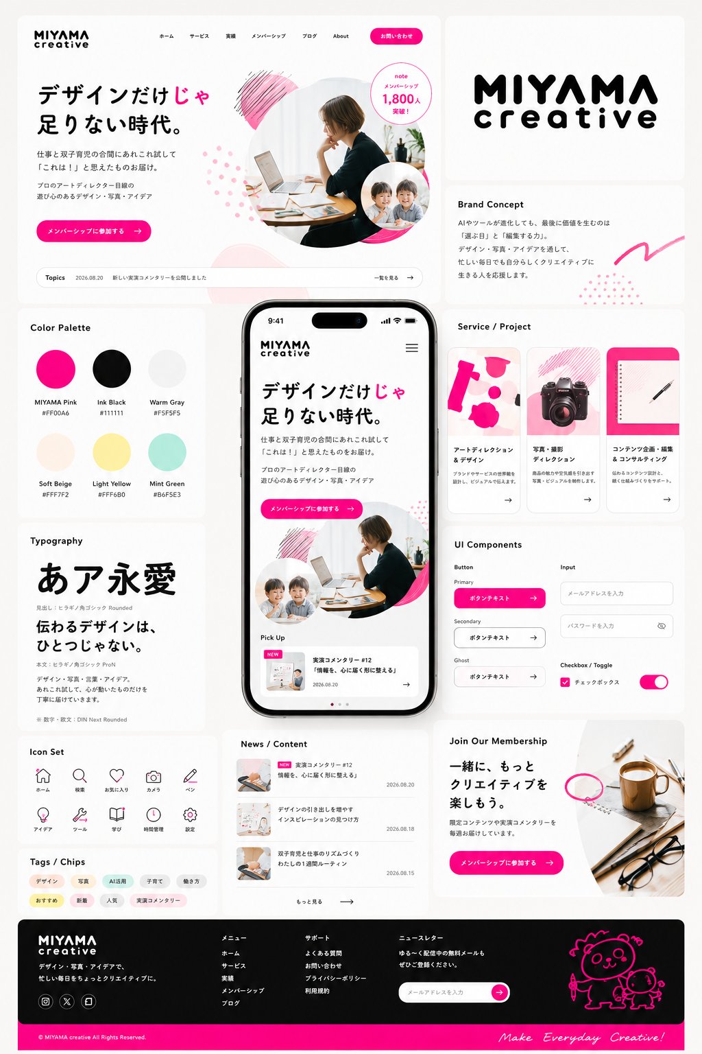
Create a premium Japanese brand design system board based on:
[THEME] {例:デザインだけじゃ足りない時代。仕事と双子育児の合間にあれこれ試して「これは!」と思えたものをお届け|プロのアートディレクター目線の遊び心のあるデザイン・写真、ブランドカラー蛍光ピンク}
[TARGET] {例:クリエイティブに興味があるデザインセンスの高い社会人}
[BRAND NAME] {例:MIYAMA creative}
Aspect ratio: 4:5
Language: Japanese
You are a top-tier creative director, art director, brand designer, graphic designer, UI/UX designer and typographer.
First interpret THEME and TARGET, then automatically determine the most appropriate brand personality, color palette, typography, imagery, information density, shapes, spacing and visual tone.
Do NOT apply the same style to every theme.
Creative brands may feel editorial and expressive; technology may feel intelligent and precise; beauty may feel elegant and sensorial; B2B may feel refined and trustworthy; family-oriented brands may feel warm and approachable.
Always choose the art direction that best fits the actual theme and audience.
The result must feel like a high-budget Japanese advertising agency or elite branding studio created a complete brand identity and digital design system.
Create one polished Figma / Behance-style showcase board with an asymmetric modular composition, generous whitespace, consistent spacing and sophisticated rounded panels.
Place ONE large realistic smartphone mockup at the visual center.
Use natural modern smartphone proportions around 19.5:9. Never make it excessively tall, thin or stretched.
Around the smartphone, compose approximately 8–12 varied modules including:
- large desktop website hero
- brand logo / wordmark
- 5–7 color palette
- Japanese typography specimen
- 3 project / service cards
- buttons, inputs, checkbox, toggle and other UI components
- icon set
- tags / chips
- news or content list
- expressive CTA card
- website footer
The desktop hero and smartphone must show convincing real website designs, not posters placed inside frames.
Build one coherent visual system across every module.
Repeat 3–5 distinctive brand devices such as characteristic shapes, corner radius, icon geometry, typography treatment, color blocks, illustration style or symbolic motifs.
Typography is especially important.
Use professional Japanese typography with strong hierarchy, beautiful line breaks, controlled spacing and a clear contrast between large headlines and small supporting text.
Prefer less text over unreadable or meaningless text.
Use photography, illustration, mascot, abstract graphics or objects only when appropriate to THEME.
They must feel custom art-directed for the brand, never like random stock assets.
Color must be intentional and controlled:
one dominant foundation + primary brand color + secondary color + limited accents.
Avoid random rainbow palettes, muddy colors and generic AI blue-purple gradients unless conceptually appropriate.
Aim for:
high-budget Japanese advertising,
premium brand identity,
award-level art direction,
polished digital product design,
excellent typography,
strong visual hierarchy,
commercially realistic production quality.
Avoid:
generic SaaS UI,
plain equal-sized grids,
cheap template aesthetics,
excessive shadows or glassmorphism,
random blobs,
inconsistent colors or corner radii,
tiny illegible text,
fake statistics or awards,
unnecessary charts or QR codes,
multiple competing smartphones,
visual clutter.
Do not maximize information.
Maximize art direction, hierarchy and brand coherence.
The final image should instantly communicate:
“This is a complete brand world designed from one strong system.”