🔔Prompt:
CITY: [CITY NAME]
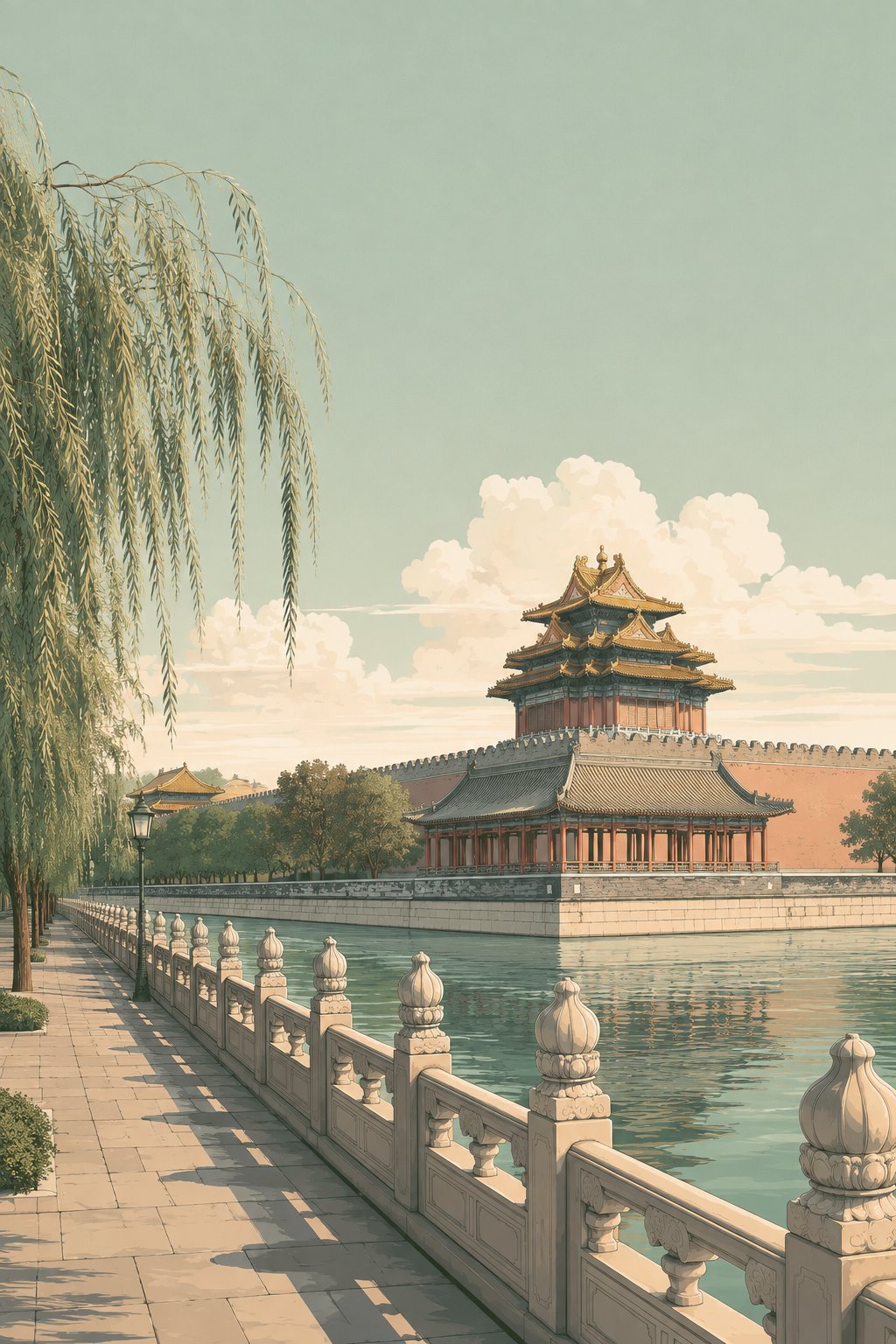
Create a sophisticated vintage city travel illustration of [CITY NAME].
Automatically choose one of the city’s most iconic, authentic, visually recognizable, and compositionally beautiful landmark views.
Build the scene around one clear primary landmark while preserving the real architectural identity of the city.
The city should be immediately recognizable even without any text.
STYLE
Refined mid-century city travel illustration
+ elegant architectural poster illustration
+ sophisticated 1960s–1970s editorial cityscape
+ smooth cinematic poster color grading
+ clean controlled linework
+ soft simplified shading
The image should feel like a beautifully preserved page from a premium mid-century international travel album.
The overall visual quality must be smooth, clean, restrained, elegant, and polished.
Avoid rough vintage printing effects.
Avoid visible brush texture.
Avoid heavy grain.
Avoid distressed paper texture.
Avoid coarse screen-print texture.
Avoid engraving-like detail.
Avoid sketchy rendering.
VISUAL SIMPLICITY
Keep the composition visually rich but carefully simplified.
Use one dominant landmark as the main focal point.
Surround it with only enough authentic city elements to establish the location.
Do not fill the image with too many buildings.
Do not create a dense skyline unless the real landmark absolutely requires it.
Secondary architecture should be simplified and visually quieter than the main landmark.
Avoid excessive windows, façade ornament, roof details, cables, railings, street furniture, signs, and tiny structural information.
The image should remain readable and elegant even when viewed at a small size.
COMPOSITION
Use a cinematic vertical 2:3 composition with clear foreground, midground, and background depth.
Keep the composition spacious.
Leave generous visual breathing room around the main landmark.
Use approximately 40–50% of the upper image for open sky whenever compositionally appropriate.
The foreground should contain only one strong leading structure or environmental element appropriate to the city.
Examples:
a quiet riverside walkway,
a simple waterfront edge,
a tree-lined road,
a park path,
a canal,
a bridge approach,
a coastal road,
a plaza,
or another authentic local element.
Do not combine many foreground devices at once.
Avoid simultaneously using elaborate railings, many street lamps, dense trees, flowerbeds, crowds, multiple boats, and complicated architecture.
Keep the foreground elegant and uncluttered.
If street lamps are appropriate, use only a small number and let them recede naturally into the distance.
If boats are appropriate, use only 1–3 visually simple boats.
No prominent people.
No crowds.
LANDMARK
The landmark should remain clearly recognizable and visually dominant.
Preserve its authentic structure, silhouette, proportions, and characteristic architectural features.
Do not exaggerate or redesign the landmark.
Do not mix unrelated landmarks from different locations.
Do not invent fictional architecture.
The main landmark should feel naturally embedded in the real city rather than isolated like an object on a blank background.
COLOR PALETTE
Use a restrained low-saturation palette dominated by:
soft sage green,
dusty mint green,
pale gray-green,
muted turquoise,
cream white,
soft ivory,
warm light beige,
pale stone gray,
desaturated blue-gray,
deep muted forest green.
Use only very small accents of:
muted brick red,
soft terracotta,
faded coral,
or antique gold.
The overall color balance should remain cool, soft, airy, and harmonious.
The dominant visual impression should be:
sage green + mint gray + creamy ivory.
Avoid strong yellow.
Avoid orange color casts.
Avoid brown vintage filters.
Avoid sepia.
Avoid high saturation.
SKY
Use a large, clean pale mint-green or sage-gray sky.
Add only a few large groups of soft creamy cumulus clouds.
Cloud shapes should be smooth, simplified, softly layered, and elegant.
Do not fill the entire sky with complicated cloud texture.
Avoid dramatic cloud formations.
Avoid highly detailed cloud painting.
The sky should create calmness and visual breathing room.
LIGHTING
Use soft late-morning or gentle afternoon sunlight.
Use elegant directional side-lighting with broad, smooth shadows.
Shadows should be simplified into clean shapes rather than fragmented into many small details.
Avoid extreme contrast.
Avoid harsh black shadows.
Avoid dramatic golden-hour lighting.
Avoid glowing orange sunlight.
Avoid excessive atmospheric haze.
SURFACE AND SHADING
Use smooth posterized shading with gentle tonal transitions.
Use soft matte surfaces.
Use low micro-contrast.
Use clean architectural edges with subtle softness.
Use broad shadow shapes rather than fine-textured shading.
Water should have smooth, elegant horizontal reflections with restrained detail.
Trees should be rendered as controlled foliage masses rather than thousands of individually defined leaves.
Buildings should have enough detail to remain authentic but should not show every window or surface texture.
The finished image should feel silky, calm, polished, and visually cohesive.
It should NOT feel gritty, rough, painterly, heavily textured, or over-rendered.
FINAL VISUAL TARGET
A sophisticated, smooth, low-saturation vintage city travel illustration with:
one clear iconic landmark,
spacious composition,
large calm sky,
rich but controlled spatial depth,
simplified secondary architecture,
soft cinematic light,
clean smooth color transitions,
minimal visual noise,
and an elegant premium travel-album atmosphere.
No text.
No city name.
No typography.
No logo.
No watermark.
No border.
No decorative frame.
No collage.
No crowds.
No prominent people.
No fantasy architecture.
No photorealism.
No watercolor texture.
No oil-paint texture.
No rough lithographic texture.
No heavy film grain.
No distressed print texture.
No hyper-detailed architectural rendering.
No glossy 3D look.
Vertical 2:3 composition.