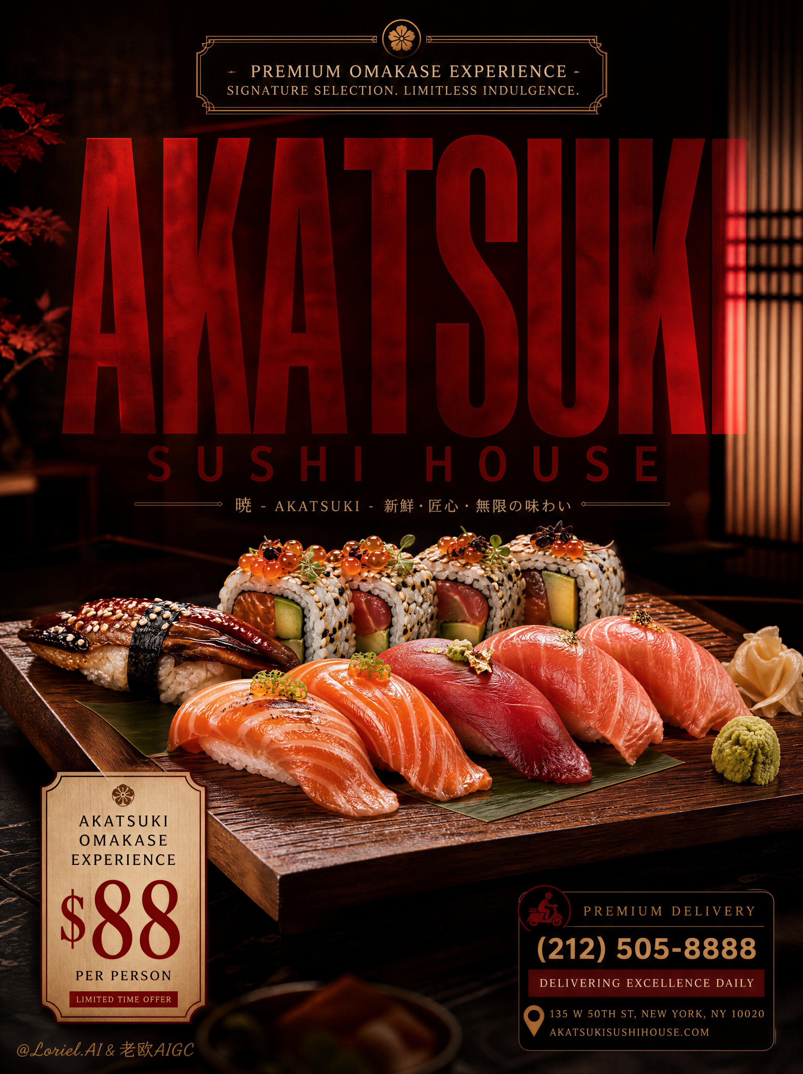
Create a Cannes-level ultra-premium restaurant promotion poster for an original upscale Japanese dining brand called "AKATSUKI SUSHI HOUSE", designed in a tall vertical mobile-first format. Preserve the same high-conversion poster skeleton as a premium commercial restaurant ad, but elevate it into a more refined, boutique Japanese dining visual. The composition must feature one dramatic oversized typographic title block dominating the upper-middle background, one hero wooden sushi board in the lower center as the main visual anchor, one polished price badge on the lower-left, and one elegant delivery/contact information block on the lower-right. The whole image must feel more luxurious, more curated, and more high-end omakase-inspired than a mass-market sushi flyer.
Core composition:
Use a strong vertical layout with a dark lacquered crimson, burgundy, and warm-charcoal restaurant atmosphere in the background. Place one monumental bold English title or brand-promotion word in the upper-middle background, set in oversized translucent or softly glowing deep red typography, acting as both headline and graphic architecture. Above or integrated near the top center, place one small premium banner strip or refined title plaque with an original English line signaling a signature sushi tasting or premium unlimited selection. In the lower-middle foreground, place a beautifully curated wooden sushi board angled slightly toward the viewer, with the board reading as a chef-level platter rather than a casual combo. The price badge remains clearly visible on the lower-left, and the delivery/contact information remains clearly organized on the lower-right. Preserve this structure exactly, but make every part feel more elegant and more expensive.
Orbit enhancement:
Push the sushi board and giant typographic backdrop into stronger flagship-poster territory. Increase the physical presence of the board, enhance fish gloss and marbling, and give the background red title more architectural impact so it feels like a branded spatial wall rather than just text. Strengthen the lighting and front-to-back depth so the sushi platter appears more precious, more premium, and more impossible to ignore. The result must feel like a restaurant hero campaign, not a generic takeaway promotion.
Port refinement:
Keep the same exact skeleton of giant background title, foreground wooden board, left-side price sign, and right-side information block, but refine the image toward a more curated boutique-Japanese aesthetic. Reduce visual noise and make the floating or edge accents much more selective and intentional. Keep only a few precisely placed out-of-focus food accents near the frame edges if they genuinely improve depth. The composition should feel more spacious, more art-directed, and more luxury-brand-oriented while preserving promotional clarity.
Food hero:
The sushi board must remain the absolute visual leader. Curate it with a premium assortment of elevated Japanese pieces: deeply marbled salmon nigiri, ruby tuna nigiri, refined maki rolls with avocado, sesame, roe, and nori texture, one or two glazed eel or signature chef bites, restrained pickled ginger, and a small elegant wasabi placement. Every piece must feel hyper-real, moist, fresh, and costly, with clean knife-work, precise rice shaping, luminous fish texture, and appetizing finish. Avoid overloading the board. This is not buffet abundance; it is premium selection with disciplined abundance.
Background and atmosphere:
Build a softly blurred high-end restaurant interior in dark warm reds and charcoal shadows. The environment should suggest lacquered wood, soft ambient lighting, and upscale Japanese dining architecture, but remain abstract enough to support the food and typography. Background depth should feel elegant and cinematic, not busy. If any foreground or edge food elements are used, they must be minimal, blurred, and placed only to enhance depth and framing.
Typography and layout:
Create entirely original English-only promotional text. The huge red background title should be bold, modern, and premium, acting as the central visual graphic. The top banner should use concise original wording appropriate for a high-end sushi promotion. The price badge on the left must feel polished and upscale, using a refined cream or warm parchment tone with elegant dark and red type. The lower-right delivery/contact block should be neatly aligned, premium, and legible, with sophisticated hierarchy for service line, number, and location details. Typography must feel intentional, graphic, and high-end, never copied and never like a cheap flyer.
Lighting:
Use rich commercial food-poster lighting with a premium restaurant feel. The key light should illuminate the sushi from upper front-left or upper front-right, creating glossy highlights on the fish, crisp edges on the rice, subtle sheen on nori, and warm reflections on the wooden board. The background should remain darker and moodier, with controlled glow around the typographic area and softer edge falloff. The food must feel vivid, luxurious, and dimensional.
Material and texture:
Render every sushi element with world-class realism: tuna with dense ruby flesh, salmon with luminous fat marbling, rice compact and delicate, nori slightly matte, roe jewel-like and bright, ginger translucent and tender, wasabi fresh and dense. The wooden board must feel hand-finished, dark-grained, and premium. The price badge and information panels must feel like refined printed poster elements, not clip-art.
Color direction:
Use a luxurious palette of lacquer crimson, burgundy, warm black, dark wood brown, salmon orange, ruby tuna red, soy umber, cream-beige for the price plaque, and small green accents from garnish or wasabi. The overall image must feel richer, deeper, more premium, and more boutique Japanese dining than a standard promotional ad.
Design intent:
The final artwork must feel like a world-class sushi restaurant poster that combines strong promotional hierarchy with a more refined high-end Japanese dining identity. The sushi board must remain the hero at all times. The giant background typography, polished left-side price badge, and right-side delivery block must all support a visually elevated, persuasive, and fully deployable restaurant campaign.
Rendering style:
ultra-realistic premium sushi advertising, upscale Japanese restaurant promotion poster, curated chef-level sushi board, monumental deep-red typographic backdrop, luxury food-poster lighting, refined delivery campaign layout, high-end commercial retouching, dark boutique restaurant atmosphere, hyper-detailed fish and roll realism, 8k, world-class image quality
Negative prompt:
copied original brand name, copied original slogan, generic sushi flyer, ugly typography, heavy black font, unreadable text, malformed letters, weak food hierarchy, deformed sushi, fake fish texture, messy rice, plastic-looking salmon, cluttered board, excessive floating food, noisy composition, low-detail background, flat lighting, cheap promo design, amateur layout, extra dishes, people, hands, low resolution, compression artifacts