Theme:
Main palette:
Spatial structure:
Micro scene:
Title:
Event details:
Aspect ratio: 9:16
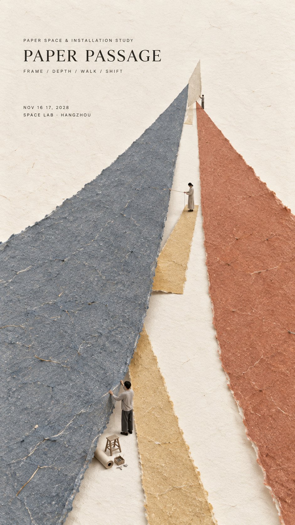
Create a refined vertical editorial poster using tactile handmade paper, large color fields, strong spatial construction, generous negative space, and a very small micro scene.
Keep the composition minimal, but give it one clear spatial mechanism. The poster should not rely on decoration. Its visual interest should come from how the paper behaves in space.
Use one or two dominant handmade paper forms and let them create depth through a simple physical relationship such as converging toward a vanishing point, lifting away from the background, forming a soft boundary, hanging vertically, bending, overlapping, or creating a hidden space.
The paper must remain clearly handmade. Show natural fibers, pulp texture, subtle pigment absorption, slight pressure marks, irregular deckled edges, and a matte dry surface.
Use perspective, scale change, paper thickness, underside visibility, soft shadows, gentle curvature, and overlap only when they support the spatial idea.
The spatial construction should feel physically believable. Avoid forms that look like digital 3D objects, smooth vector graphics, or abstract CGI sculptures.
Add one very small micro scene that helps explain the main structure. Include two or three adult figures naturally interacting with the paper installation, such as lifting, measuring, aligning, supporting, observing, or adjusting it.
Keep the figures tiny, modern, understated, and secondary. The entire scene should occupy only about 2% to 4% of the poster.
Use only a few necessary tools or props. Every object should support the physical logic of the scene.
Preserve large areas of warm ivory negative space. The empty space should create calm, scale, and contrast around the main paper form.
Typography should remain restrained and editorial. Use a refined serif for the title and small uppercase sans serif for supporting information. Keep the title relatively small and place it in a quiet area of negative space.
The visual reading order should be:
large paper structure first, spatial depth or physical interaction second, material texture third, micro scene fourth, title and event details last.
The final result should feel minimal, tactile, spatial, intelligent, contemporary, and refined.
From a distance, the poster should read as a strong and simple composition.
Up close, it should reveal perspective, curvature, edges, fibers, shadows, tiny figures, tools, and the physical logic behind the installation.