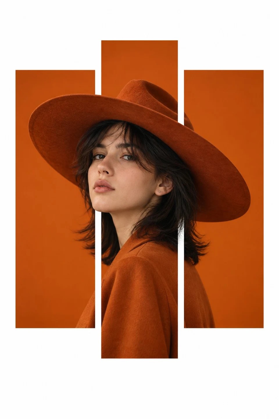
Portrait reference: [upload one portrait]
Main palette: [soft lavender / custom]
Accent color: [deep plum / custom]
Secondary accent: [cool silver gray / custom]
Subject style: [mature woman with short wavy hair / custom]
Aspect ratio: 9:16
Use the uploaded portrait to create four separate fashion editorial portrait posters. Keep the same person, facial identity, hairstyle, outfit direction, photographic realism, typography family, color system, and overall art direction across all four images.
Build the visual system around a bright, low saturation palette. Use pale lavender or soft lilac as the dominant background, deep plum for oversized typography, cool silver gray as a restrained secondary graphic color, and pearl white or light gray for clothing.
The overall look should feel refined, modern, fashion editorial, and visually striking, with realistic skin texture, natural hair strands, believable fabric folds, clean photographic lighting, strong typography, controlled negative space, and full bleed composition.
Create these four layout variations:
1. SHIFT
Divide the portrait into several clean horizontal photographic sections. Apply only subtle horizontal displacement and very slight scale variation between sections. Keep the face attractive, recognizable, and mostly aligned. Do not excessively duplicate the eyes, lips, nose, or other facial features. The effect should feel like refined editorial photo editing, not digital distortion. Add oversized horizontal “SHIFT” typography in deep plum.
2. LOOP
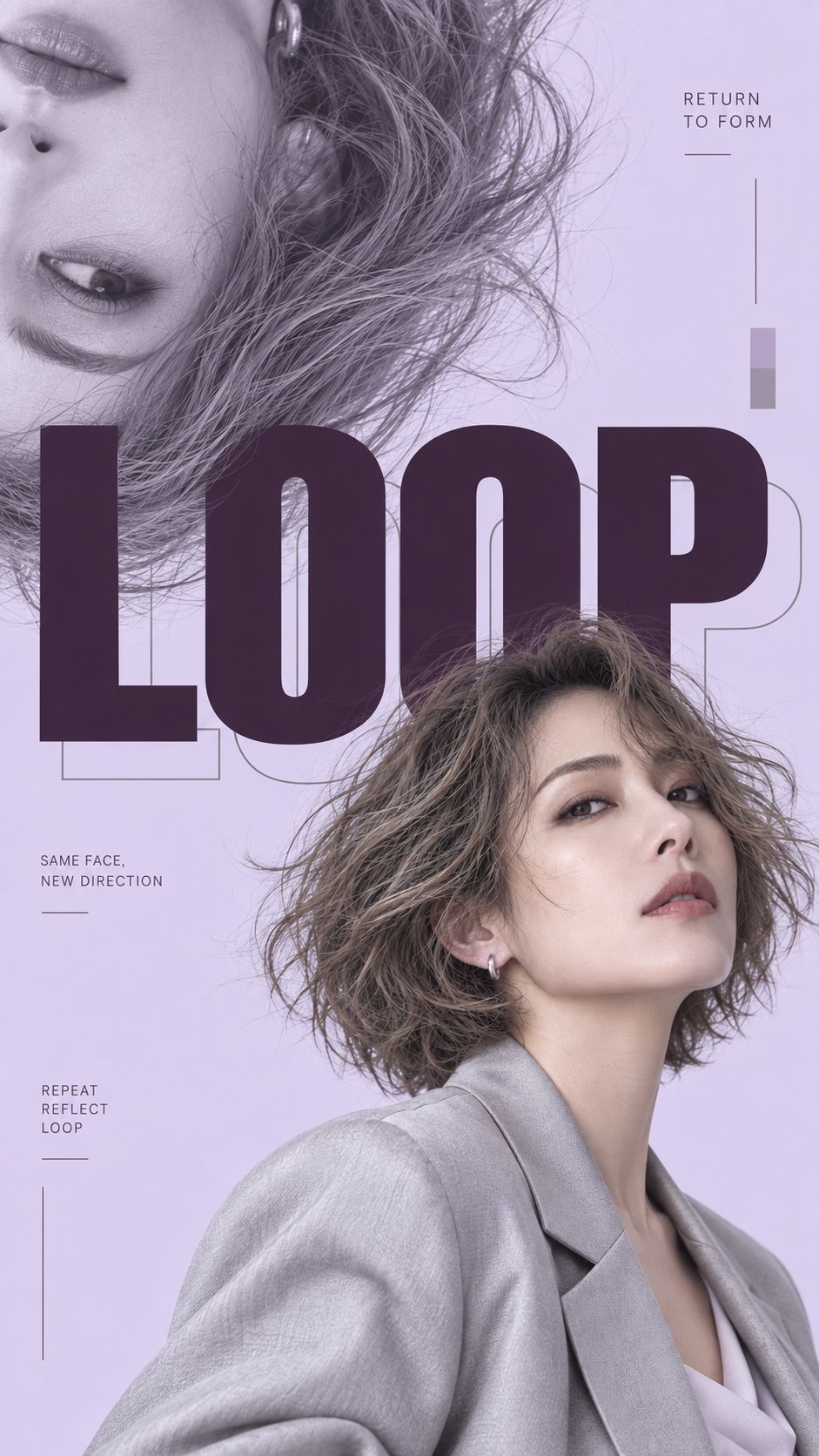
Show the same subject twice: one normal portrait and one enlarged 180 degree flipped partial portrait entering from the opposite corner. Use only one normal portrait and one flipped partial portrait. Add oversized “LOOP” typography with a subtle silver gray outline echo. Let the portraits, hair, and typography overlap naturally.
3. AXIS
Place one complete color portrait on one side and one enlarged monochrome facial detail on the other, showing mainly one eye, brow, and hair. Place oversized vertical “AXIS” typography between them as the central visual spine. Use deep plum solid letters with one restrained silver gray outline letter. Add a narrow silver gray vertical graphic element to reinforce the axis.
4. VEIL
Use oversized condensed “VEIL” typography as the main composition. Place the portrait behind and between the letterforms so the eyes, lips, hair, and shoulders appear through the typography. Mix solid deep plum letters with a small amount of silver gray outline type for depth.
Keep each poster visually distinct while clearly belonging to the same series.
Use meaningful supporting editorial copy rather than random placeholder text. Keep secondary text minimal and subordinate to the portrait and oversized typography.
Full bleed design only. Let backgrounds, portraits, and typography reach the edges of the canvas. Do not add an outer border, poster frame, white margin, safety frame, NO., VOL., numbering, barcode, sparkle symbols, random text, complex UI elements, RGB glitches, scan lines, or decorative clutter.
Especially for fragmented portrait layouts, preserve facial identity and natural anatomy. Avoid excessive facial repetition, duplicated eyes or lips, extreme misalignment, or broken facial structure.
Generate all four posters as separate standalone 9:16 images, not combined into one collage.