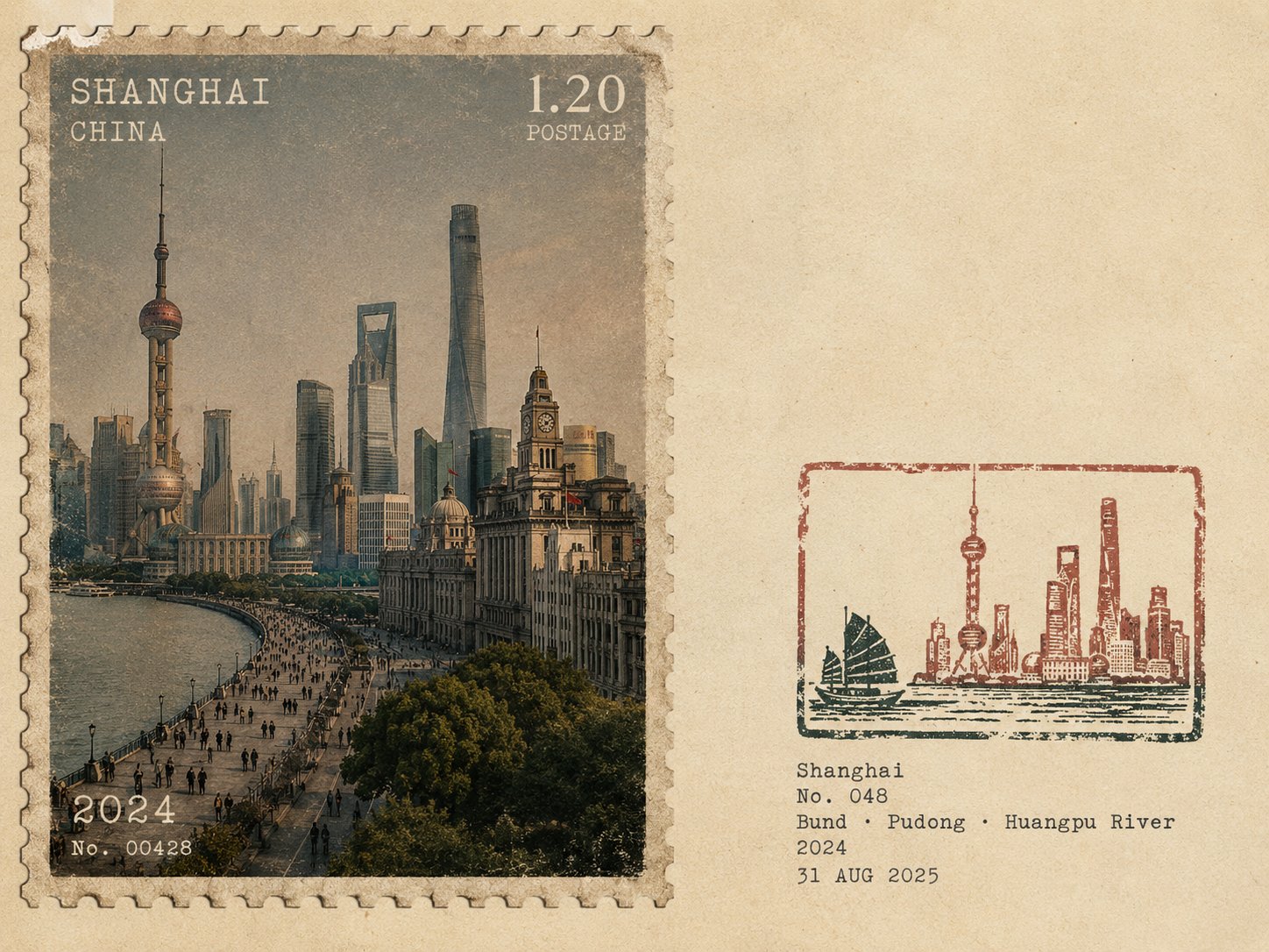
Create one separate poster for each travel image. Never combine multiple images or create a collage.
FORMAT & LAYOUT
Use a 4:3 landscape composition with two seamless regions:
Left ~58%: a realistic vintage photographic postage stamp featuring the destination.
Right ~42%: warm off-white aged paper with generous negative space.
No obvious dividing line.
LEFT — VINTAGE PHOTOGRAPHIC POSTAGE STAMP
Create a realistic photographic scene of {LOCATION}, accurately depicting its recognizable architecture, landscape, people, vegetation, terrain, perspective, lighting, shadows, and natural atmosphere.
The scene must remain photographic and realistic, with only subtle archival grading and fine film grain.
Make it resemble an authentic vintage travel postage stamp with:
Subtle perforated edges
Aged printed texture
Mild ink absorption
Slight print wear and tonal variation
Natural analog character
POSTAGE TYPOGRAPHY
Integrate small vintage postal typography directly into the stamp:
{LOCATION_ENGLISH}
Small {COUNTRY / REGION}
POSTAGE denomination or numerical value
{YEAR}
Optional small serial/issue number
Use restrained serif, engraved, condensed, or archival lettering with subtle fading and imperfect ink. Keep typography away from important visual details. Avoid modern branding, fake government logos, and decorative slogans.
RIGHT — RUBBER STAMP
Create a small 2–4 color hand-carved rubber-stamp impression representing the most recognizable features of {LOCATION}.
Simplify the scene into strong visual shapes such as architecture, mountain contours, roads, shorelines, settlements, vegetation, or distinctive silhouettes. Remove unnecessary crowds, vehicles, repetitive buildings, and fine details.
Place the stamp in the lower-middle of the right panel, occupying about 30–38% of the panel height, with generous whitespace.
Use muted colors inspired by the destination. Add authentic handmade imperfections: uneven carving, broken edges, dry ink, paper show-through, granular texture, uneven pressure, ghosting, and subtle 1–2 mm color misregistration.
It should look like a genuine hand-stamped mark on aged paper, never a clean vector logo.
FIELD-NOTE TEXT
Add small typewriter-style text near the stamp:
{LOCATION_ENGLISH}
No. {NUMBER}
{KEYWORD 1} · {KEYWORD 2} · {KEYWORD 3}
{YEAR}
{DATE}
Keep the text small, understated, and secondary.
STYLE
Quiet, archival, tactile, regional, understated, and collectible — like a genuine travel document combining a vintage photographic postage stamp with an architect's field-note rubber stamp.
AVOID
No collage, obvious divider, tourist-souvenir aesthetic, oversized postage graphics, giant typography, circular or wax seals, stickers, generic icons, cartoon styling, vector art, 3D rendering, glossy gradients, oversaturation, excessive detail, decorative clutter, or invented landmarks.
Priority: Create an authentic photographic representation of the destination while making the left panel feel like a genuine vintage postage stamp and the right panel like a minimal handcrafted field-note stamp.